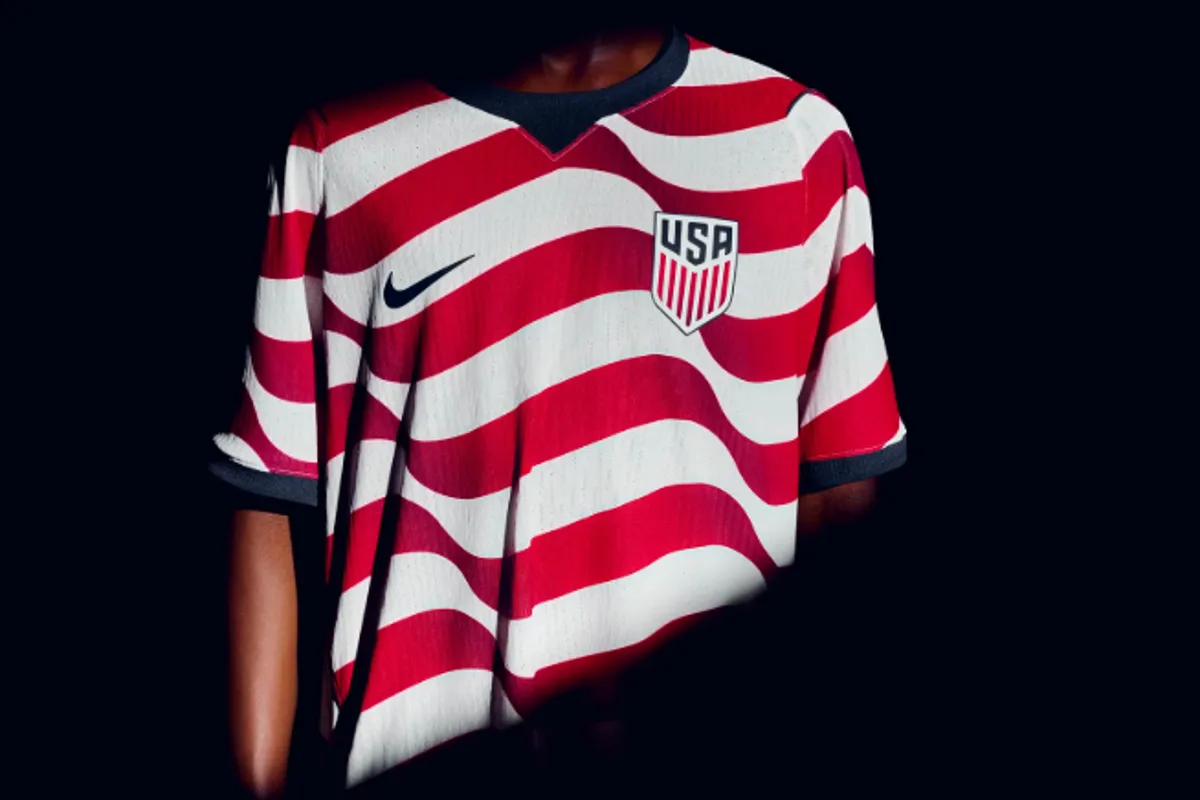
US Soccer's New World Cup Kit Sparks Fan Debate Over 'Waldo' Design
US Soccer's New World Cup Kit Sparks Fan Debate

US Soccer's New World Cup Kit Unveiled, Prompting Mixed Fan Reactions

The United States men's national soccer team has officially revealed its new uniforms for the upcoming 2026 FIFA Men's World Cup, but the design has already ignited a passionate debate among supporters. The kit, developed in partnership with Nike, features two distinct jerseys: a "stars" kit and a "stripes" kit, both intended to be worn by all 27 U.S. Soccer national teams, including the highly decorated women's national team.

'Waldo Remix' Comparisons Dominate Online Discourse

The "stripes" kit, characterized by its bold red and white wavy stripes designed to mimic a waving flag, has drawn immediate and widespread comparisons to the classic children's puzzle book character Where's Waldo. This is not the first time U.S. Soccer has embraced such a design; the team's primary kit from 2012 to 2014 was famously nicknamed the "Waldo" jersey due to its similar striped aesthetic.

Despite the nostalgic callback, many fans took to social media to express their opinions, with reactions ranging from humorous to critical. "Personally, I'm a big Where's Waldo fan," one supporter joked, while another succinctly stated, "It's giving Where's Waldo." A third fan dubbed the shirt the "Waldo remix," highlighting the design's familiar yet updated appearance.

Not all feedback was lighthearted, however. Some fans voiced frustration over the perceived lack of innovation in U.S. Soccer's kit designs. "Will the U.S. ever get a decent kit!?!?" one fan complained, with another adding, "Why do we have the ugliest kit every World Cup?!?" Critics also pointed out alternative comparisons, likening the stripes to a candy cane or a strip of toothpaste, further fueling the online conversation.

Contrasting Designs: Loud Stripes Versus Subtle Stars

In contrast to the vibrant stripes kit, the "stars" jersey offers a more understated look. It features a navy blue base adorned with subtle black stars and red trim, providing a sleek alternative for players and fans alike. Ronnie J. Stewart, global product director for Nike, explained the strategic thinking behind the dual designs. "If you want to be loud and proud and represent the crest, no one's going to doubt who you're there for in the light kit," he said. "If you're looking for that lifestyle look that works off the field, the dark is for you."

This sentiment was echoed by USMNT forward Folarin Balogun, who revealed that several teammates had expressed a desire for the return of the red-and-white stripe look. "I know a few of the lads said they wanted the 'Where's Waldo' theme," Balogun told reporters. "And obviously when they revealed the kit, that's exactly what they kind of did. So that was pretty cool." However, Balogun personally favored the "stealthiness" of the blue stars-themed kit, underscoring the diverse preferences within the team.

Unified Kits and Broader Implications

For the first time in U.S. Soccer history, all 27 national teams will wear identical kits, a move aimed at fostering unity and brand consistency. In a joint press release, Nike and U.S. Soccer emphasized that the stars and stripes kits symbolize "the pride of wearing the crest, not just for players on the field, but also for the fans who support them every step of the way."

Dave Wright, Chief Commercial Officer of U.S. Soccer, highlighted the significance of the 2026 tournament, which will be hosted in the United States. "With the 2026 FIFA Men's World Cup coming to the United States, we're excited to see players across all 27 of our National Teams and supporters across the country wearing this kit as we build toward an incredible moment for the game," he stated.

The new kits are set to make their debut in upcoming international friendlies, with the USMNT scheduled to face Belgium on March 28 and Portugal on March 31. As the team prepares for these matches and the broader World Cup campaign, the kit reveal has undoubtedly sparked conversation, blending nostalgia, design critique, and national pride in equal measure.