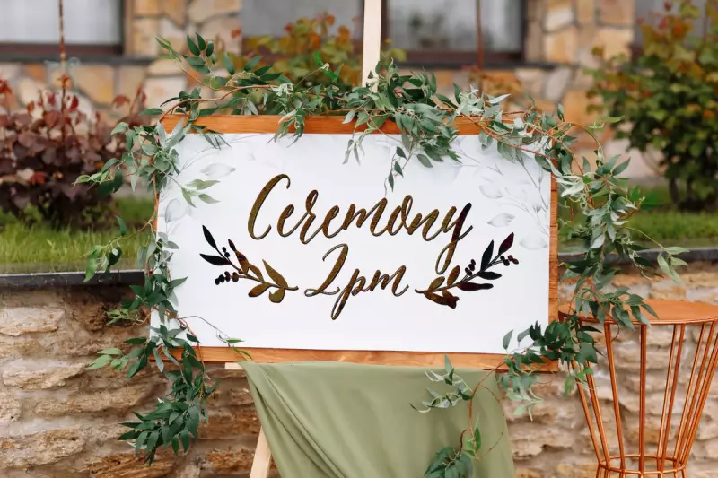
A particular calligraphy style, often seen on wedding invitations, has become a hot topic among soon-to-be-wed couples. While some adore its elegant, flowing curves, others dismiss it as overused and clichéd.
The Font That Divides Opinions
The script in question features delicate loops and exaggerated flourishes, reminiscent of traditional handwritten notes. Its popularity surged in recent years, appearing on everything from save-the-dates to place cards.
Why Some Couples Love It
Advocates argue the font adds a touch of timeless romance to wedding stationery. "It feels personal and luxurious," says one bride. Designers note its versatility—it pairs equally well with rustic and modern themes.

The Backlash Grows
Critics compare it to the ubiquitous "Live, Laugh, Love" decor, calling it the typographic equivalent of a tired trend. "It's lost all originality," remarks a London-based stationer. Some couples now actively request alternative styles to stand out.
What Experts Recommend
Graphic designers suggest these alternatives for couples seeking uniqueness:
- Modern minimalism: Clean sans-serif fonts with subtle spacing
- Art deco revival: Geometric scripts with vintage charm
- Handwritten hybrids: Custom blends of print and cursive
Ultimately, typographers remind couples that font choice should reflect their personality—not just current trends.