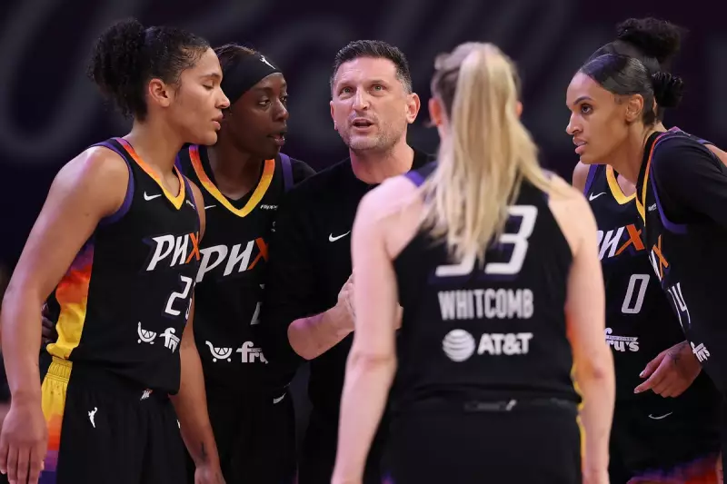
The Phoenix Mercury, one of the Women's National Basketball Association's most celebrated franchises, has unveiled a comprehensive rebranding effort as they approach their landmark 30th season in the league.
A Modern Evolution for a Legacy Brand
On Monday 24th November 2025, the three-time WNBA champions revealed their new suite of logos, marking a significant moment in the team's history. Team President Vince Kozar emphasised that this represents an evolution rather than a complete overhaul of their visual identity.
The Mercury will maintain their iconic purple and orange colour scheme, ensuring continuity with their rich heritage. However, the expansion of their logo portfolio provides greater flexibility for merchandise sales and marketing initiatives moving forward.
"Being sort of a legacy brand was instructive to the process of us developing a rebrand," Kozar explained. "We didn't want a huge departure. We wanted fans to be able to see the old mark in the new marks. We wanted a modernization and evolution — not a wholesale rebrand."
Subtle Nods to Team History
The redesigned logos incorporate several clever references to the Mercury's distinguished past. The primary logo features the Mercury 'M' positioned at a precise 19.97-degree angle, directly referencing the year of their inaugural 1997 season when they debuted as one of the WNBA's original eight teams.
Another significant addition acknowledges the popular "Merc" nickname that has been embraced by players and supporters alike for years. This secondary mark represents the first of its kind in the franchise's history, providing fans with fresh branding options.
The PHX alternate logo, which originally debuted in 2021 as a tribute to the team's X-Factor supporters, continues to symbolise the strong connection between the organisation and the Phoenix community.
Substantial Investment in Women's Basketball
Kozar acknowledged the considerable financial commitment required for such a comprehensive rebrand, praising team owner Mat Ishbia for his unwavering support. "Stuff like this — I'm not quite sure fans quite understand the amount of investment it takes to do something like this," Kozar noted.
This branding refresh follows closely after the franchise's $100 million, 58,000-square foot practice facility opened less than two years ago. Located just a block from their main arena, the state-of-the-art complex features two full-size courts, a weight room, and theatre-style meeting rooms.
Critically, this facility is dedicated exclusively to the Mercury, who previously shared training spaces with the NBA's Phoenix Suns. Ishbia, who acquired both teams in early 2023, has consistently advocated for greater investment in women's basketball across the league.
"I don't want this to be a competitive advantage," Ishbia stated during last October's Finals. "I want everyone else to do the same thing." This philosophy underscores a broader commitment to elevating the entire WNBA rather than simply pursuing individual team success.
With their championship legacy secured through titles in 2007, 2009, and 2014 – achieved largely through the exceptional contributions of 11-time All-Star Diana Taurasi – the Phoenix Mercury's rebranding represents both an honouring of their past and a confident step toward their future.


