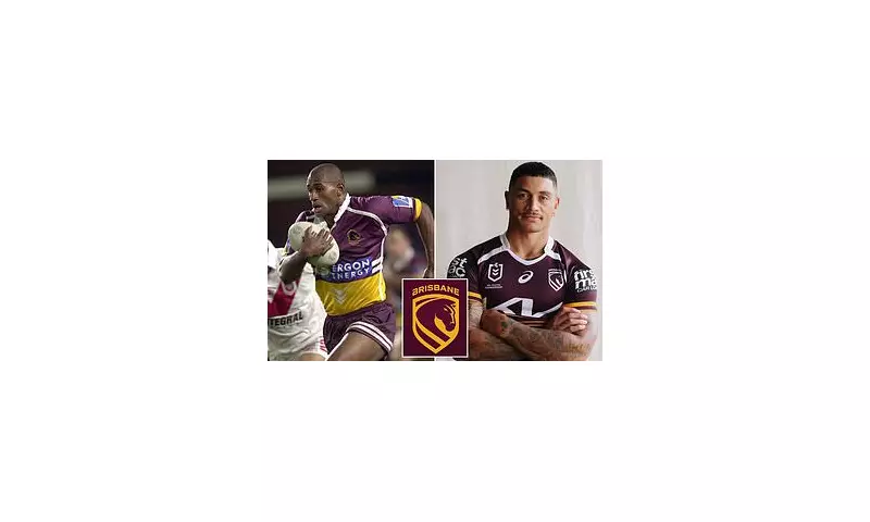
The Brisbane Broncos have unveiled a dramatic new club logo, a move that has immediately divided their passionate fanbase and drawn a brutally honest verdict from one of their most celebrated former players.
A Knight's Move? Tuqiri's Blunt Assessment
Cross-code legend and Broncos premiership winner Lote Tuqiri did not hold back in his critique of the fresh design. Speaking to Channel Nine, the former star, who made 99 appearances for the club between 1999 and 2002, stated, 'It doesn't scream toughness, I don't think.' He went further, comparing the emblem to a familiar game piece. 'It's a bit weird; they've spent a lot of money on something that looks pretty plain. It looks a bit like that chess piece, the knight.'
Tuqiri, who won a premiership with the side in 2000, expressed a preference for the club's historical imagery. 'When you look at the Broncos and the history of the logo, it shows innovation, but this seems to be going with the flow rather than something different,' he added. 'The original [logo] from 1988 — I love that, the Bronco coming out of the shield.'
Unveiling a New Era: Design and Rationale
The reigning NRL premiers officially launched the new badge on Tuesday, alongside a new team motto, 'We Charge On'. This replaces the previous logo, which was introduced in 2006 and has now been retired following the team's recent grand final victory.
The club has described the new design as featuring a more modern aesthetic. Key elements include:
- The Brisbane River flowing through a shield around the horse's head.
- A significant change from the word 'Broncos' to 'Brisbane' on the badge, a move designers say ensures 'no matter how far we go, people know where we're from.'
- The reintroduction of a shield, a nod to the team's original jersey.
- A large sweeping gold stripe in the horse's mane, another reference to the Brisbane River.
Broncos CEO Dave Donaghy championed the change, stating, 'This is more than just a logo - it's a statement of who we are, where we're from and importantly, where we're headed.' He emphasised that the rebrand positions the club for global recognition as it moves towards the Brisbane 2032 Olympics and the NRL's international expansion.
Mixed Reactions from Fans and a Club Icon
The public response to the logo has been sharply polarised. On social media, one fan pleaded, 'Can we just go back to the classic original and be done with it? This seems unnecessary,' while another countered with a simple, 'It's actually really good.'
Adding to the chorus of criticism from former players, Brisbane icon Steve Renouf, who made 183 appearances for the club between 1988 and 1999, also voiced his reservations. He told Channel Nine that the horse's head in the new design did not look 'free'. 'If you want me to look at it with the part of my brain that's marketing, it looks like there's a horse head trapped inside whatever that is,' Renouf said, confirming his preference for the previous logo.
As the Broncos charge into a new season with a new identity, the debate over their visual representation is clearly just getting started.


