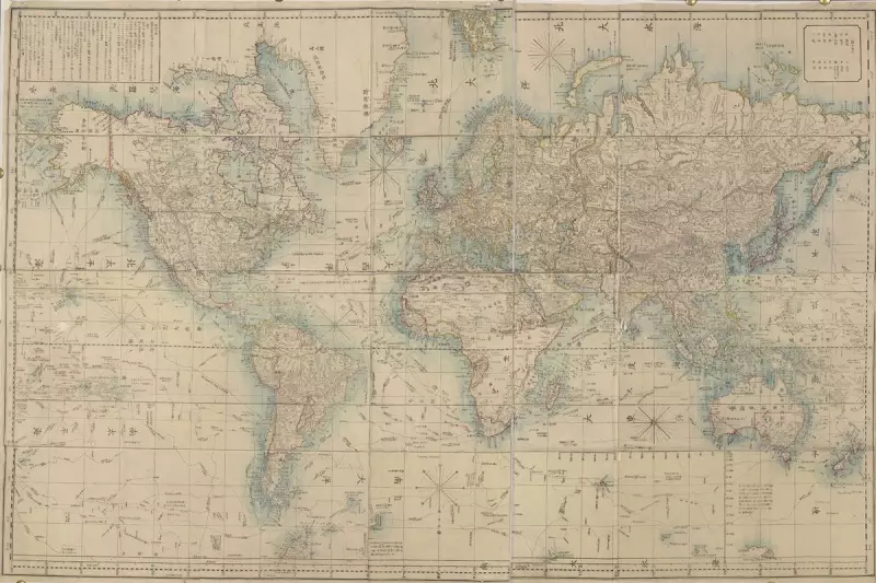
For centuries, world maps have depicted Africa as significantly smaller than its actual size. This distortion stems from the Mercator projection, a mapping technique developed in the 16th century that prioritises navigational accuracy over proportional representation.
The Mercator Misconception
The Mercator projection, created by Flemish cartographer Gerardus Mercator in 1569, stretches landmasses near the poles while compressing those near the equator. This results in Africa appearing roughly the same size as Greenland on many maps, when in reality Africa's land area could comfortably fit Greenland 14 times over.
Why This Matters
This cartographic distortion has significant implications:

- Geopolitical perceptions: The visual shrinking of Africa may contribute to underestimating its global importance
- Educational impact: Generations have grown up with an inaccurate understanding of continental sizes
- Economic consequences: The misrepresentation potentially affects investment decisions and development policies
Alternative Mapping Solutions
Several alternative projections attempt to address these distortions:
- The Gall-Peters projection shows areas in correct proportion but distorts shapes
- The AuthaGraph projection, used by Japanese architects, maintains better shape and area accuracy
- Interactive digital maps allow users to switch between different projections
As global awareness of this issue grows, educators and policymakers are increasingly advocating for more accurate representations of our world's geography.