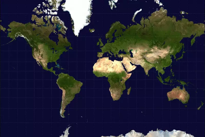
For centuries, world maps have misrepresented the true size of Africa, making the continent appear significantly smaller than it actually is. The reason? A cartographic technique known as the Mercator projection, which distorts landmasses closer to the poles.
The Mercator Misconception
Created in 1569 by Flemish cartographer Gerardus Mercator, this projection was designed for nautical navigation. However, its side effect is a dramatic distortion of landmass sizes—particularly near the poles. As a result, countries like Greenland appear almost as large as Africa, despite Africa being 14 times larger in reality.
Africa’s True Scale
To put it into perspective:

- Africa could fit the United States, China, India, and most of Europe within its borders.
- The Democratic Republic of Congo alone is larger than Western Europe.
- Algeria dwarfs the entire landmass of France, Spain, and Portugal combined.
Why Does This Matter?
This distortion isn’t just a geographical quirk—it has real-world implications. Misrepresenting Africa’s size perpetuates a skewed perception of the continent’s global significance, affecting everything from education to geopolitics.
Alternatives to Mercator
Modern cartographers have proposed more accurate projections, such as the Gall-Peters or AuthaGraph maps, which better represent landmass proportions. However, the Mercator map remains dominant in classrooms and digital platforms like Google Maps.
Next time you glance at a world map, remember: Africa isn’t as small as it seems.