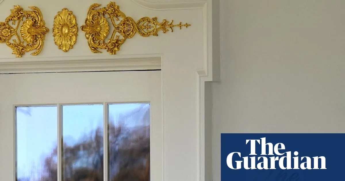
A lavish gold sign declaring 'The Oval Office', which appeared outside the White House, has now mysteriously vanished. The sign, which President Trump's spokesperson confirmed was personally crafted by the President, was part of a sweeping and controversial makeover of the official residence.
The Rise and Fall of the Gold Sign
The sign, printed on decal paper and taped up, immediately divided opinion. Supporters saw it as a flourish of classic Trumpian glamour. Critics, however, were quick to mock its aesthetic, comparing the cursive font to the Cheesecake Factory logo and mass-produced home décor.
Now, the sign has disappeared as abruptly as it arrived. The White House has declined to explain its removal. A spokesperson defended the President's direct involvement, stating, 'He is very involved in these beautification projects… [President Trump] is making the White House beautiful and giving it the glory it deserves.' The spokesperson added that only those suffering from 'Trump Derangement Syndrome' would object to the changes.
A Sweeping White House Makeover
The sign was just one small part of a much larger renovation project launched by Trump just months into his second term. The most dramatic change has been the demolition of the White House's East Wing, historically home to the First Lady's offices. This move kick-started a race to finish a new $300 million ballroom before his term ends.
Other upgrades across the presidential residence include:
- Remodelling the Lincoln bathroom in marble.
- Adding new sculptures and redesigning the Rose Garden.
- Installing a 'Presidential Walk of Fame' with ornate gold portraits of recent presidents.
Notably, the portrait of former President Joe Biden is represented only by an autopen copy, excluding him from the display. The overall aesthetic strongly mirrors the gilded parlours of Trump's private properties, such as Mar-a-Lago and Trump International Golf Club.
Expert Criticism and Defence of Tradition
The renovations have drawn sharp criticism from those who believe the White House should uphold a different standard. Rick Paulus, who served as White House chief calligrapher under Presidents Clinton and George W. Bush, expressed his dismay.
'It is the people's house… we are not pompous, or not supposed to be at least,' Paulus told the Daily Mail. 'That is why we don't have gilded halls, for a reason. It's all about tradition - this guy doesn't give a hoot about tradition.'
He recalled that during his tenure, First Ladies like Hillary Clinton and Laura Bush oversaw tasteful renovations, while presidents typically stayed out of the décor business. On the subject of the now-vanished sign's font, Paulus was brutally honest, calling the 'Shelley' script 'pedestrian' and 'the most basic of the scripts.'
He concluded, 'If you want to do any branding at that level, you don't go for the cheesiest and most accessible font... They totally did not care about that. He saw gold and script and said it was amazing. I wouldn't say he has a discerning eye.'
As the White House continues its transformation, the debate over its new look rages on, symbolising a deeper conflict between Trump's vision of opulence and the traditional view of the building as the 'People's House'.