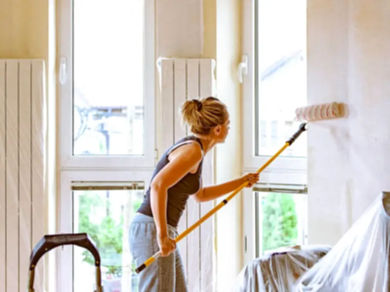
Dealing with a compact living room can be a real challenge, and not everybody has the funds to build an extension or remove walls. With a growing number of homeowners opting to improve their existing space rather than relocate, there is an affordable solution to make rooms appear more spacious than they actually are.
The answer lies in the clever use of paint, according to interior design expert Lisa O'Hanlon from The Shutter Store. She explained that colours have a 'powerful effect' on the brain, with blues encouraging calm and relaxation, while red leaves people feeling more energised. Paint shades can also significantly influence how large a room feels, and certain colours can be used to make a space 'look bigger'.
White: A Classic Choice for Spaciousness
White may appear straightforward and uninspiring, yet it's highly effective at making living rooms seem more spacious than they truly are. For those who find brilliant white too stark or clinical, softer off-white tones work equally well. Lisa said: 'White does not have to be dull. It is all in how you style the room around it. By adding colour through soft furnishings like rugs, carpets or curtains, it livens up the room whilst maintaining the brightening benefits of white walls.'
Pale Blue: Soft Tones for an Illusion of Space
Gentle blue tones such as sky blue, baby blue and pastel blue can all help a compact room 'appear bigger', according to the interior expert. She noted: 'Whilst most options that give the illusion of more space tend to be paler neutrals, using soft shades of blue can give the same effect while also being a more intriguing design choice.' Soft blues pair well with striking, warm colours. Rich and vibrant reds, shades of orange and soft pinks all complement the cool tones of pale blue nicely.
Emerald Green: Sophisticated and Dimension-Adding
Rich green hues appear sophisticated and enduring, and are frequently chosen by celebrities and interior specialists. They can also introduce a visual dimension to the home, but only when used to colour-drench the space. This requires covering the skirting and even the ceilings in this shade. Lisa added: 'Accenting the room with lighter shades like champagne or a dusty pink will help complete the effect.'
Lavender: Unconventional but Effective
Lavender might appear an unconventional option for walls, but it's excellent for making spaces appear larger, according to the specialist. Combined with touches of green, lavender works wonderfully if you have numerous houseplants in the lounge. Lisa said: 'With a growing number of people wanting to bring plants and other natural elements into the home, colours like lavender allow those shades of green to contrast against the walls, drawing people's eyes straight to your collection.' Similar to other lighter shades, lavender comes with the added benefit of creating an expansive feel. It enables light to naturally bounce off the shade, generating the impression that there is more room than there actually is.
Navy: A Soothing and Contrasting Shade
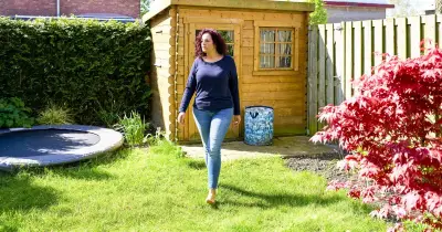
Much like pale shades of blue, navy can create a soothing effect in a space and add much-needed dimension. It complements white beautifully, creating a striking contrast in a space, particularly in a living room. It also works harmoniously with orange, dusty pinks and vibrant yellows. Particular fence shades can also create the illusion of a larger garden. This is ideal if you're working with a courtyard or a more compact outdoor area.