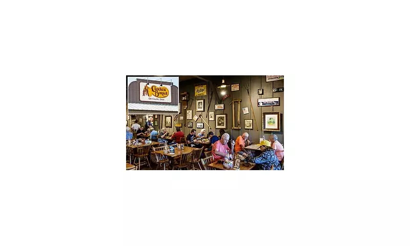
In a breathtaking corporate volte-face, American dining chain Cracker Barrel has been forced to scrap a radical new logo just hours after its unveiling, following a blistering backlash from shareholders and patrons alike.
The now-abandoned redesign, which replaced the chain's traditional, home-style script with a stark, modern font, was met with immediate and ferocious criticism. The swift and decisive reversal has been hailed as a masterclass in listening to one's customer base, a move that directly translated into a significant financial uptick.
Market Rewards Swift Action
The most telling reaction was on Wall Street. The company's stock price, which had been languishing, experienced a dramatic surge following the announcement that the old logo would be reinstated. This powerful market response underscores the immense value investors place on brand stability and customer loyalty, viewing the scrapped rebrand as a potential liability that was swiftly neutralised.
A Lesson in Brand Heritage
Analysts suggest the intense negative reaction stems from Cracker Barrel's core identity. The chain has built its reputation on nostalgia, traditional American comfort food, and a rustic, homely aesthetic. The sleek, minimalist proposed logo was perceived as a jarring departure from these cherished values, alienating the very demographic it relies upon.
The episode serves as a potent reminder that for heritage brands, even well-intentioned modernisation efforts carry immense risk. The visceral connection customers have to familiar branding elements can be far stronger than any desire for a contemporary look.
By listening to the outcry and acting with remarkable speed, Cracker Barrel's management has not only quelled a potential crisis but has also demonstrated a commitment to preserving the brand's unique character, a decision that has already paid substantial dividends.


