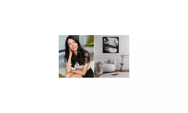
An acclaimed interior designer has outlined the colour trends that will define our living spaces in the coming year, advising which shades to retire and how to embrace the surprising hue set to dominate 2026.
The Colours to Leave Behind in 2025
According to luxury London-based interior designer Jo Hamilton, several popular colour palettes are losing their appeal. She suggests that home style enthusiasts should consider moving away from cool greys, stark blue-based whites, sugary pastels, and high-contrast pops of primary colour.
"Nothing is truly 'wrong', but a few things are losing steam," Hamilton told the Daily Mail. "I'm thinking of cool greys because they flatten a room and don't sit well with today's warmer, more organic materials."
She described very stark, blue-based whites as feeling "clinical" and noted that sugary pastels often "don't carry enough depth". The use of bold primary colours as accents was criticised for feeling "gimmicky rather than considered".
Pantone's 2026 Champion: The Rise of 'Cloud Dancer'
This advice comes as colour authority Pantone announced its Colour of the Year for 2026 on Thursday. The selected shade is a milky white named 'Cloud Dancer' (Pantone 17-1230), a choice that has ignited a mix of reactions online.
Some critics labelled the vanilla-esque hue "boring" and "clinical", expressing disappointment that a bolder colour wasn't chosen. However, others praised it as a perfect symbol of "new beginnings", "healing", and "peace", suited to a fast-paced world.
Jo Hamilton is firmly in the latter camp, welcoming the selection. "It's not a bright, clinical white - it has a soft chalkiness to it," she explained. "It feels calm and grounded, which is exactly what most people want from their homes at the moment. Design has become less about showmanship and more about creating spaces that exhale a little, and Cloud Dancer is perfect for that."
How to Style the New Neutral Trend
For those looking to incorporate the Cloud Dancer trend affordably, Hamilton offers reassuring news: white is "one of the easiest colours to use affordably", provided you avoid flat, rental-style whites.
The key to mastering this look, she insists, is texture. "Think in terms of natural, elevated materials such as linen in its raw, open weave; textured or limewashed walls; hand-thrown, chalky ceramics; carved or honed stone; beautifully grained timber in pale, honeyed tones," Hamilton advised. "These are the pieces that give Cloud Dancer its depth and sophistication."
She also recommends mixing different white tones to create a nuanced, atmospheric space. "Warm linen next to limewash next to pale timber. That variation creates atmosphere and interest without ever feeling busy."
For budget-conscious decorators, Hamilton suggests upcycling existing items like timber stools or mirror frames with a soft matte white finish. She also advocates investing in a few well-chosen, texturally interesting pieces—like a beautiful linen throw or a handcrafted ceramic—over numerous cheaper accessories.
"Even in my highest-budget schemes, I rely on layering natural textures," she said. "Texture is the great equaliser — it brings warmth, subtlety and soul, regardless of what you spend."
Hamilton concluded with a warning against overly curated interiors, stating: "Homes aren't show homes — they're lived-in spaces. They need soul, which is often where much of their beauty comes from."


