I have made a lot of mistakes with paint. There was the time I helped an ex-boyfriend douse his entire room black, including the ceiling, or in my first house when I confidently chose what I thought was a soft, warm neutral that dried to the colour of congealed custard. Not to mention the patchy finishes, needing way more coats of paint to cover a wall than I had accounted for because the paint was either the wrong finish or too watery. Or forking out a fortune on paint only to realise that the quality was much the same as a cheaper alternative.
Here are the seven things I wish I had known before such things had occurred.
1. Paint is never just one colour
The shade you fall for under fluorescent shop lighting will not be the shade that greets you at home. It will shift, subtly, mostly disappointingly, with the time of day, the direction of the light, the weather and even your mood. Morning light may make it feel fresh and hopeful; evening can render it murky or unexpectedly pink. That calm grey you loved? It will probably lean lilac by dusk. You are not imagining it. Paint is a shape-shifter.

Takeaway: Always test colours on multiple walls in the room, especially those facing different directions. Check them at three points in the day, morning, afternoon and evening, and always test under artificial light before committing. We live in the UK, and our lights are on more often than not, so this can completely change how a colour appears.
2. The finish matters as much as the shade
Matt, eggshell, satin, gloss, these are not mere technicalities. Most people use matt emulsion on the walls, but it scuffs very easily (trust me) and should be avoided on staircases. Vacuum cleaners, suitcases and smudgy fingers are all enemies of matt emulsion. Always check whether a matt paint is washable before you assign it to a busy room in the house.
Gloss and satin paint finishes are having a resurgence and work in small spaces as they help bounce and reflect light around a room, making the space feel lighter. They are also more hardwearing than matt finishes so tend to work better in high traffic areas such as kitchens and bathrooms. Just remember to prep the surface meticulously as gloss shows up every lump and bump.
Eggshell (named for its slight luster resembling a chicken egg) offers a low-sheen, durable, and versatile option. It bridges the gap between flat matte and satin, providing a soft, velvety appearance that hides wall imperfections while resisting stains better than matte. It is ideal for living areas and low-traffic wood trim.
Takeaway: Use matt for low-traffic areas like bedrooms, eggshell for living spaces, and more durable finishes such as satin or gloss for kitchens, bathrooms and woodwork. I often use Farrow & Ball, Mylands and Francesca’s Paints.
3. Coverage is an optimistic estimate
The tin will promise a certain number of square metres, delivered with the confidence of someone who has never met your walls. In reality, coverage depends on the surface, the previous colour of those walls and how generously you apply it. Painting dark shades over light tones is usually fine. Light over dark requires multiple coats. Buy more than you think you need. Running out halfway through a wall is a particular kind of despair.
Takeaway: Calculate your wall area and then add at least 10 to 20 per cent extra paint. Keep a small amount for future touch-ups as batch colours can vary slightly.
4. It is not about the brand, it is about the quality
I have often fallen into the trap of thinking that all expensive paint is good and cheaper paint is bad. That is not always the case. I have been on shoots where I have brought expensive paint only to be told by the set builder that the quality is poor and it will require more coats for full coverage. The brand I get asked for most often by set builders is Dulux, which is one of the more affordable options on the market.
Takeaway: Look for paints with high pigment levels and good opacity rather than focusing purely on brand or price. If in doubt, ask decorators or builders what they actually like to use, they are usually the most honest reviewers.

5. Never buy paint from what you have seen online
Yes, colour walls at DIY stores can be intimidating, but it is imperative that you choose your swatches in person rather than online. Colours can look wildly different on screens. The trick is to remember that most displays are organised by the temperature of colours. This means that the display will shift from warm shades such as reds to cooler shades like blues. You will also notice that in the middle of the display, the colours are more subdued and muted. These colours have warm and cool elements to them.
Takeaway: Look for colours in the middle, with less saturation, as opposed to the vibrant, crisp outer-perimeter shades. These tones work more easily with most schemes.
6. Tester pots are not optional (no matter how decisive you think you are)
I once naively believed I could ‘just tell’ from a swatch. This is the kind of confidence that led to walls the colour of congealed custard. In my experience anything can look good the size of a thumbnail, but changing the minute covers an expanse of space. Buy the tester. Paint a generous square, larger than feels necessary, and live with it for a few days. Move it around the room if you can.
Takeaway: Paint your tester onto a piece of card or lining paper so you can move it around the room without committing to one spot and without marking multiple walls.
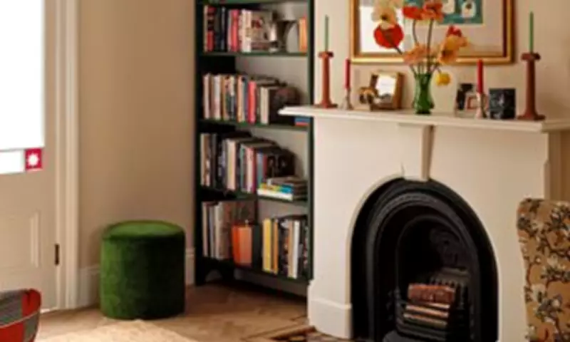
7. Always listen to the architecture of your home
High ceilings, low ceilings, awkward alcoves, generous windows, all of these will influence how a colour reads in a room. A shade that looks airy in a magazine might feel heavy in a smaller space. Conversely, a deeper tone can add intimacy and depth where a pale one feels washed out. The architecture is not a neutral backdrop; it is an active participant in the outcome. You are not painting a blank canvas but entering into a negotiation.
Takeaway: Use lighter shades to open up small or low-ceilinged spaces, and do not be afraid of darker tones in larger rooms. They can make a space feel more intentional and grounded.