A fascinating new interactive map allows users to discover which cities around the world share the same latitude, revealing surprising parallels between distant locations. Created by X user @vicnaum, the simple website lets you check which cities lie on the same parallel as your hometown, as well as the mirrored parallel in the opposite hemisphere.
Northern Hemisphere Parallels
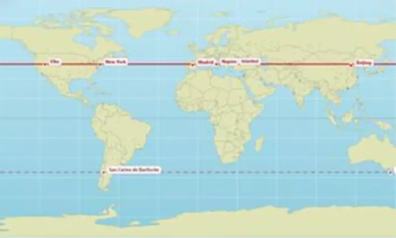
The map reveals that Edinburgh and Moscow both sit at 56°N, while Vancouver and Paris share the 49.3°N latitude. New York and Madrid are both found at 40.9°N, alongside Naples, Istanbul, and Beijing. Other notable parallels include London and Saskatoon at 52.1°N, Chicago and Andorra at 42.6°N, Los Angeles and Baghdad at 33.7°N, Orlando and New Delhi at 28.5°N, Miami and Taipei at 25.4°N, and Honolulu and Hong Kong at 21.4°N.
Southern Hemisphere Parallels
In the southern hemisphere, Buenos Aires and Perth are parallel at 32.2°S, while Rio de Janeiro and Alice Springs share the 23.8°S latitude. Quito and Singapore are nearly on the equator at 0.1°N.

What Latitude Means for Daylight
Cities on the same latitude generally experience the same length of daylight on any given day. However, they do not have the same sunrise or sunset times, nor the same amount of actual sunshine due to weather conditions. As you move farther from the equator, seasonal changes in daylight hours become more dramatic.
The creator explained: 'You can expect the same sunlight hours (longer nights, shorter days, etc) and similar sun power there.'
User Reactions
Baffled users have shared their reactions online. One person commented that they 'get the same amount of sunlight as Antarctica.' Another said: 'When you realise at 45 years old that Marseille and Toronto are practically on the same parallel.' One user noted they had 'no idea Orlando and Delhi were at the same latitude.' Another joked: 'As you freeze your a**e off in Chicago keep in mind it's the same latitude as Madrid.'
Map Distortion Controversy
The map also highlights the ongoing debate about map projections. The Mercator projection, commonly used in schools and commercial maps, is known to distort the size of landmasses, making areas near the poles appear larger than they are. Africa, for instance, is three times bigger than North America and significantly larger than Russia, yet on the Mercator map, it appears smaller.
Last year, the African Union backed a campaign to replace the Mercator map with a more accurate representation, such as the 'Equal Earth' map, to better reflect Africa's true size and importance. The AU argued that the distortion perpetuates harmful misconceptions about Africa's geopolitical and economic significance.
To explore your own hometown's parallel, use the interactive map created by @vicnaum.