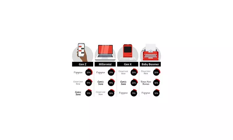
Have you ever considered that your go-to font choice might be revealing more about your personality than you realise? According to psychological research, the typefaces we select for everyday communication can offer fascinating insights into our character traits and professional demeanour.
The Psychology Behind Popular Fonts
Typography experts and psychologists suggest that font preferences are far from arbitrary. They can indicate everything from your level of creativity to your attention to detail and even your trustworthiness.
Comic Sans: The Controversial Casual
Often maligned by design purists, Comic Sans remains one of the most recognisable – and divisive – fonts in existence. Those who favour this playful typeface are typically perceived as creative, informal, and approachable. However, research indicates it may also suggest a lack of seriousness in professional contexts.
Times New Roman: The Traditionalist's Choice
As the default for many academic and legal documents, Times New Roman projects an air of reliability and formality. Users of this classic serif font are often viewed as conscientious, traditional, and detail-oriented individuals who value established conventions.
Helvetica and Arial: The Modern Minimalists
These clean, sans-serif fonts have become ubiquitous in corporate communications. Preference for these modern typefaces suggests practicality, efficiency, and a preference for clarity over decorative elements. Users are often perceived as professional and straightforward.
What Your Font Selection Says in Different Contexts
The impact of font choice varies significantly depending on the situation. While a playful font might be perfect for a child's birthday party invitation, it could undermine your credibility in a business proposal.
- Professional Settings: Conservative fonts like Garamond or Georgia convey reliability
- Creative Industries: More distinctive fonts can showcase innovation
- Personal Communication: Your natural preferences reveal authentic personality traits
The Science Behind Font Perception
Multiple studies have demonstrated that people make subconscious judgments about content based solely on typography. Research published in the British Journal of Psychology found that readers assess the credibility of information differently depending on the font used, even when the content remains identical.
Another fascinating aspect is how font readability affects information retention. Fonts that are easier to read are often associated with tasks being easier to accomplish, influencing how people perceive the complexity of instructions or information.
As we continue to communicate increasingly through digital channels, understanding the subtle language of typography becomes ever more important. Your font choices are silently communicating volumes about you – perhaps it's time to consider what message you're really sending.


