Broncos Unveil Controversial New Era Branding
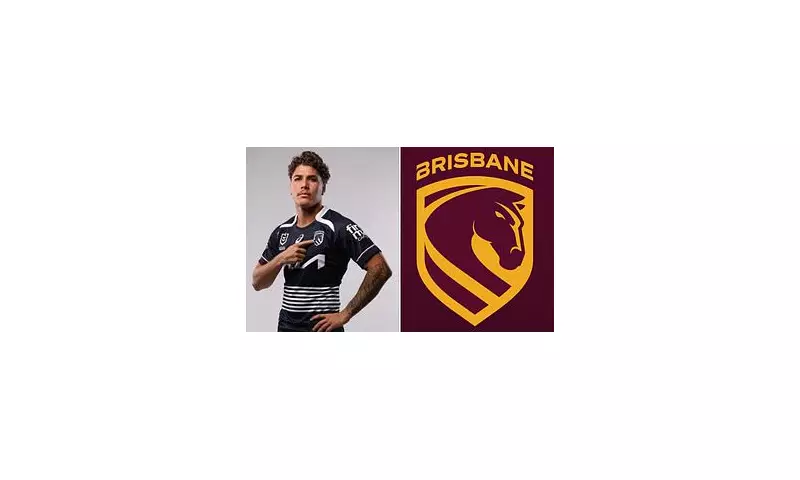
The Brisbane Broncos have sent shockwaves through the NRL community by revealing a completely new logo and playing kit that has immediately divided their passionate fanbase. This marks the club's first emblem change since their premiership victory in 2006, coming fresh off their grand final triumph over Melbourne in 2025.
Design Elements and Symbolism
The modernised design features several significant elements that pay homage to the club's history while looking toward the future. A forward-facing bronco takes centre stage, projecting a more aggressive and determined形象 than previous iterations. The design incorporates a shield shape that nods to the original 1988 logo when the club first entered the competition.
Perhaps the most distinctive new feature is the inclusion of the Brisbane River flowing through the mark, symbolising the club's deep connection to its home city. Club CEO Dave Donaghy described the rebrand as more than just visual changes, stating: "This is more than just a logo - it's a statement of who we are, where we're from and importantly, where we're headed."
Mixed Reactions Flood Social Media
Fan response to the unveiled logo has been sharply divided across social media platforms. Many supporters expressed strong disapproval, with comparisons drawn to the recent negative reception of the Bulldogs' new emblem last month.
One X user commented: "This makes me feel better as a bulldogs fan. We no longer have the worst logo in the comp." Another added: "Can we just go back to the classic original and be done with it? This seems unnecessary."
However, not all reactions were negative. Some fans embraced the change, with one Instagram user writing: "It's actually really good", while another simply stated: "Actually rate this."
Controversial Away Jersey Colour Scheme
Accompanying the logo reveal was the introduction of the Broncos' 2026 home and away jerseys. While the home strip maintains the traditional design fans have come to expect, the away kit has surprised many with its predominantly midnight-blue colour scheme.
The unconventional choice pays tribute to Cyril Connell, the club's chief talent scout for nearly two decades who played a crucial role in identifying future stars. Connell, who passed away in 2009, is credited with bringing legendary players including Darren Lockyer, Shane Webcke and Petero Civoniceva to the Broncos.
Some supporters remain unimpressed with the colour departure. "Blue? Someone must still be celebrating the GF. Queensland is Maroon. There is nothing wrong with the white with maroon and gold. Blue is not Queensland," one social media user protested.
Another concerned fan noted: "No thanks. Colour looks too close to the [Melbourne] Storm," highlighting potential kit confusion with rival teams.
Looking Toward a New Era
The comprehensive rebrand introduces a powerful new battle cry for the club's next chapter: 'We Charge On'. This phrase is intended to capture the club's forward momentum following their 2025 grand final victory and signal their ambitions for continued success.
The jersey design echoes the club's 2010 tribute kit to Connell, further cementing the historical connection while moving the visual identity forward. As the Broncos prepare to defend their premiership title, the new branding aims to symbolise both respect for their rich history and confidence in their future direction.
With the 2026 season approaching, time will tell whether the divided fanbase will unite behind the new identity or whether the controversy will continue to dominate discussions around one of the NRL's most successful clubs.


