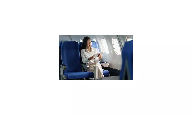
Have you ever settled into your airplane seat and wondered why the cabin so often features shades of blue? The choice is far from random. Aviation giants like Boeing and leading interior designers employ sophisticated colour psychology to shape the passenger experience, aiming to soothe nerves and convey safety.
The Science of Calm at 35,000 Feet
With Boeing responsible for over 14,000 aircraft globally and manufacturing hundreds of new planes each year, every design detail is meticulously planned. The prevalent use of blues and greens inside cabins is a deliberate strategy. Boeing itself has explained that these hues are intrinsically linked to connotations of peace and tranquillity.
Rishi Kapoor, CEO of Nanak Flights, emphasises this calming effect. He notes that despite air travel being statistically the safest mode of transport, many passengers still experience stress. "It might seem like an insignificant detail," Kapoor told Reader's Digest, "but it's one that helps make flying the best way to travel." The subtle use of colour is a key tool in managing passenger anxiety.

From Corporate Trust to a Homely Feel
Aviation designer Nigel Goode provided further insight to The Telegraph, tracing the colour's history and application. "Blue became the colour of choice because it’s a conservative, non-contentious, corporate shade that symbolises being trustworthy and safe," he said. This is why it features heavily in the liveries and cabins of legacy carriers like British Airways.
However, the application varies. Goode explained that while budget airlines might opt for brasher, bolder shades, most full-service carriers choose muted tones. "The overarching aim is to create a home-like relaxing feel, so airlines tend to use muted colours that feel domestic, natural and earthy for that reason," he stated.
Perception of Space and Sensation
The specific shade of blue holds significant power. Lighter colours are known to make interiors feel more spacious and airy, a crucial perception in a confined cabin. Conversely, darker tones can create a sense of something being smaller and narrower.
The influence of colour extends beyond mere aesthetics to affect physical perceptions. Virginia Tripp, a designer for Teague, previously informed Boeing that "Colours also can influence a person's perception of humidity, temperature and aroma." She elaborated that blue can evoke a fresh or clean sensation, while blue and green together might make passengers feel cooler. In contrast, warmer colours like orange can increase the perception of heat, and pink might suggest a sweet fragrance.
Ultimately, the ubiquitous blue airplane seat is a masterpiece of considered design. It is a fusion of corporate identity, psychological reassurance, and practical spatial planning—all working silently to ensure your journey feels safer, calmer, and more comfortable.