Shoppers at the popular discount chain Home Bargains have been left both baffled and enlightened after encountering mysterious in-store displays that double as unofficial colourblindness tests.
The Reddit Revelation
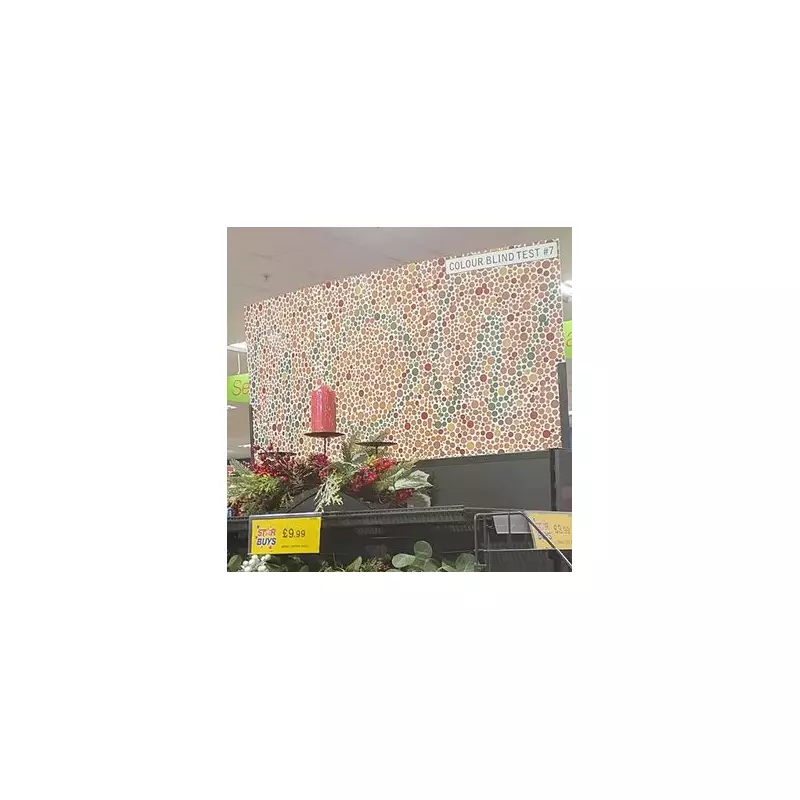
The phenomenon came to light when one confused customer took to Reddit to share a photograph of a large sign displayed in a Home Bargains store. The sign featured a pattern composed of orange, red, and blue dots, prompting the shopper to question why the retailer was displaying what appeared to be colour blindness tests.
The post, which asked "Why does Home Bargains have colour blindness tests on display?", quickly garnered significant attention. The user noted that the signs were double-sided and multiple copies were positioned throughout the shop.
The Hidden Message Revealed
Upon closer inspection, the seemingly random pattern of blue dots actually spells out the word "wow". This design is characteristic of Ishihara colour vision tests, commonly used to identify colour vision deficiencies.
The social media thread became an impromptu support group, with numerous users realising for the first time that they might be colourblind. One user commented, "Can someone tell me what it says? I'm so colour blind!", while another admitted, "Uh oh, I was 100% certain it said LOVE. Or is everyone messing with me?"
An Unexpected Public Service
Many commentators praised Home Bargains for providing this unexpected public health service. One Reddit user observed, "You'd be amazed at how many people do not know they're colourblind so this is actually a public service. Home bargains coming through for the nation yet again."
Some shoppers even expressed gratitude towards the retailer for helping them discover their condition. One user confirmed the message read "WOW" and added, "also just found out I'm not colourblind, thanks."
Interestingly, another user pointed out the potential irony of the sign's placement, noting, "There's a certain irony of them having this next to a display that's primarily red and green."
A Deliberate Marketing Strategy
According to a former employee who commented on the thread, these signs are not a new development. They explained that the displays were part of a marketing strategy dating back approximately 20 years.
The ex-staff member revealed, "I remember when they first appeared in our store... There were a handful of designs all to be displayed on the end of aisle displays. All had the word 'Wow!'... As far as I know they were there to help catch your eye for the display underneath."
The intention was to highlight what the store considered its "best" bargains in prominent end-of-aisle positions, using eye-catching designs to draw customer attention to special offers.
While it remains unclear when the original Reddit photo was taken, the discussion confirms that these clever signs have been serving a dual purpose for years: promoting products while inadvertently screening customers for colour vision deficiencies. The Mirror has contacted Home Bargains for an official comment on this unexpected secondary function of their store displays.