


Entertainment

Jaclyn Smith, 80, Shares Four-Word Secret to Her Youthful Glow
Jaclyn Smith, 80, reveals her four-word secret to looking young: clean living and being loved. The Charlie's Angels star also discusses the show's legacy.


Politics

Hajj 2026: Over 1.5 Million Muslims Mark Day of Arafah in Mecca Amid Regional Tensions
Over 1.5 million Muslims gather in Mecca for the Day of Arafah, the holiest day of Hajj, amid a fragile ceasefire and extreme heat. Pilgrims pray for peace and spiritual renewal.


Sports

NFL London 2026 Tickets: How to Buy for Tottenham and Wembley Games
Learn how to buy tickets for NFL London 2026 games at Tottenham Hotspur Stadium and Wembley Stadium, including dates and matchups.


Crime

NSW Football Club Mourns Sudden Death of Beloved Player Mitchell Weeden, 38
The Northern Storm Football Club in Coffs Harbour is grieving the sudden loss of Mitchell Weeden, 38, a devoted father, husband, and club vice president who died on May 20.


Health


Environment
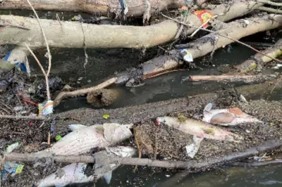
Massive Fish Kill in Georgia River Under Investigation
Thousands of dead fish were found along a 20-mile stretch of the Chattahoochee River in Georgia, prompting a major investigation into the cause, possibly linked to low oxygen from recent flooding.

Mediterranean Cooling Secrets for UK Heatwaves
Ancient Mediterranean techniques like white roofs and shutters can cool UK homes during heatwaves, reducing indoor temperatures by up to 4°C and combating urban heat island effects.

Stay Cool Without AC: Passive Cooling Tips for UK Heatwaves
As heatwaves intensify, experts recommend passive cooling over air conditioning to reduce energy costs, emissions, and inequality. Learn how shading, ventilation, and behavior changes can keep your home cool.

Yellowstone's Grand Prismatic Spring: Alien-Like Beauty
Explore breathtaking aerial views of Grand Prismatic Spring in Yellowstone, where vibrant blue and orange colors create a surreal landscape, thanks to heat-loving microbes.

Pessimism Bigger Problem Than Climate Change: McEwan
Ian McEwan argued that pessimism is a bigger issue than climate change, urging optimism as a moral duty, as UK broke May heat records. He spoke alongside Minette Batters on farming challenges.
Monday Sports Challenge: Football, Cricket & Rugby Questions
Start your week with our Monday sports quiz featuring 100 questions about British football, cricket, and rugby. How well do you know these popular UK sports?
