Forget frantic searches for mindfulness apps or expensive wellness retreats. The secret to true calm might be as simple as looking at the right hue. Pioneering scientific research has now pinpointed the single most calming colour for the human mind, and the results might surprise you.
The Winning Hue: A Portal to Peace
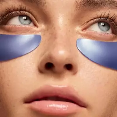
Through a series of meticulous experiments measuring physiological responses like heart rate and brain activity, scientists have concluded that a specific shade of soft, greenish-blue is the ultimate champion of calm. This particular hue, reminiscent of serene tropical waters or a tranquil morning sky, consistently produced the most significant reduction in stress indicators amongst participants.
Why This Colour Works: The Science of Sight and Mind
The power of this colour isn't just a subjective preference; it's rooted in human biology and psychology. Our brains are hardwired to associate this gentle blue-green with positive, calming elements of nature.

The key associations include:
- Water: It evokes the stillness of a clear lake or a calm sea, universally recognised symbols of peace.
- The Sky: It mirrors the soothing tones of a peaceful, dawn horizon.
- Safety: In the natural world, these colours often indicate safe, life-sustaining resources, triggering a primal sense of security.
This connection to the natural world is crucial. In our increasingly urban and digital lives, exposure to these nature-inspired colours can provide a much-needed psychological reset, lowering cortisol levels and slowing a racing heart.
Harnessing Calm: How to Use This Colour in Your Life
Integrating the world's most calming colour into your environment is a simple yet powerful way to cultivate a more serene atmosphere. Designers and wellness experts suggest subtle incorporations rather than overwhelming a space.
Effective applications include:
- Painting a bedroom or study wall in this soothing shade to create a restful sanctuary.
- Choosing bedding, throws, or cushions in this colour palette to promote relaxation.
- Incorporating elements like vases, artwork, or even a lampshade to add touches of tranquillity.
The principle extends beyond the home. Consider this colour for office accents to combat workplace stress or even in a desktop wallpaper for a momentary digital escape.
A Palette for Modern Wellbeing
This research moves beyond anecdotal evidence, providing a scientific foundation for the use of colour in therapeutic and design settings. It confirms what artists and healers have long suspected: that colour is a powerful, non-invasive tool for influencing our emotional and physical state.
In a world where anxiety and stress are prevalent, the discovery of this ultimate calming colour offers a simple, accessible, and beautiful strategy for enhancing our daily wellbeing. It seems the path to peace might be painted in a very specific shade of blue-green.