Interior designers have identified five popular paint colours that can unintentionally make a home appear cheap and tacky, urging homeowners to consider alternatives for a more sophisticated look.
Bright Red: Overwhelming and Unsettling
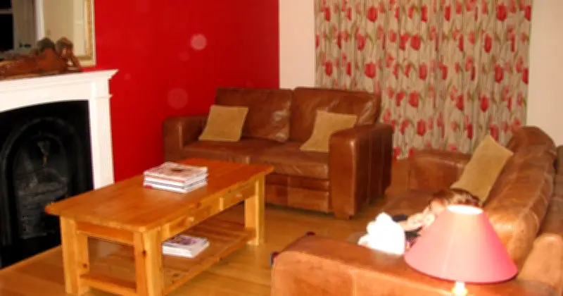
Todd Harmon, designer and co-founder of Aura Modern Home, warns that bright red, especially on all four walls, can overwhelm a space. “In kitchens, the colour may evoke an old-time American diner; in bedrooms, it's too stimulating to relax. Instead of bold and chic, it often feels loud or even cheap,” he said. Harmon recommends softer, earthy shades like muted burgundy, rich terracotta, or diluted crimson for warmth and depth.
Teal: Nostalgic but Tacky
Interior designer Cristina Mata told Martha Stewart that teal is a colour she struggles to love. “Once a darling of the 90s, and often paired with glossy, plastic finishes, teal now feels more nostalgic than fresh. As an accent, it rarely achieves the sophistication it aims for and can easily tip into tacky territory,” she said. Mata suggests warmer greens or gentler blues for a more natural, balanced atmosphere.
Pure White: Lacks Personality and Looks Rental-Like
Interior designer Bethany Adams told Livingetc: “To me, bright white walls scream cheap rental. I absolutely love a neutral colour scheme, but choosing the right white is key.” She advises opting for off-whites with delicate undertones for more depth. Adams also emphasizes the importance of finish: “Make sure to choose a flat or matte finish if you have an older home. Any hint of sheen will highlight cracks and imperfections, which makes your house look crummy no matter how expensive it actually was.”
Dark Brown: Outdated and Dingy
Dark brown paint, popular in the 1990s and 2000s, can cheapen a room quickly, according to Joni Burden, executive chairman and creative director of J. Banks Design. She told Veranda that choosing an outdated brown can make a room look dingy or muddy.
Mint Green: Inconsistent and Tricky
Christine Kohut, owner of Christine Kohut Interiors, says mint green can make a space look cheap. The shade can appear green, blue, or grey depending on light, creating a constantly shifting vibe that isn't ideal. While it has potential, it requires careful consideration.