Vibrant shades are set to command our wardrobes in 2026, with forecasts pointing to bold statements in cobalt blue, tomato red, and Pantone's Cloud Dancer white. Yet, as last year's butter yellow trend proved, a colour being fashionable doesn't guarantee it will be flattering. This realisation is fuelling a major resurgence in professional colour analysis, moving it from an 80s novelty to a modern tool for intentional, mistake-proof shopping.
The Modern Revival of Colour Analysis
Once found primarily in department stores and style guides, colour analysis has found a new audience. Its revival is driven by social media platforms like TikTok and aligns with the growing 'buy less, buy better' philosophy. The core question is shifting from 'Is this colour in fashion?' to the more personal 'Is this colour right for me?'
Michelle Marks, a colour analyst consultant for House of Colour in the UK, explains the foundational process. "The first thing we work out is are you warm? Are you cool?" she says. "Once we know, then we go between the two seasons: winter and summer are cool, autumn and spring are warm."

The distinction between seasons hinges on contrast. Winters are bright, sharp, and high-contrast, while summers are soft and tonal. Springs are warm and crisp, and autumns are warm and soft.
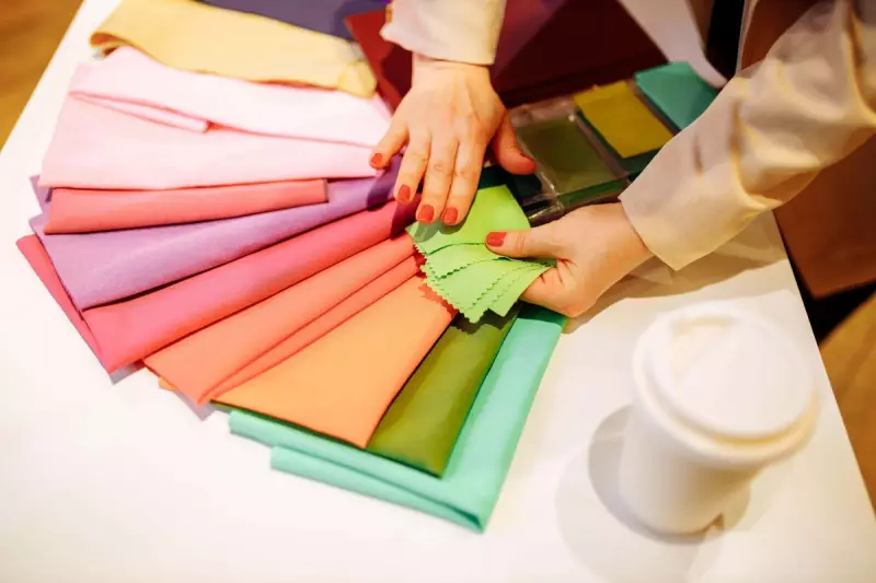
A Personal Assessment: Expectations Versus Reality
The assessment is a practical, visual exercise. Different coloured fabrics are draped beneath the client's face—warm green against cool green, optic white beside cream. The analyst looks for how the colours interact with the skin. Does the jawline become more defined, or does it melt away, indicating the colour washes you out? Do blue undertones or shadows become more pronounced?
Personal assumptions often prove wrong. Journalist Lara Owen, who underwent an analysis, expected to be a 'summer' due to her light skin and mousey blonde hair, typically leaning towards soft blues and navy. The result was a surprise, highlighting that self-perception doesn't always match professional analysis. Even experts like Michelle Marks had similar revelations. "I wanted to be anything but a winter and I was very upset," she admits. "But now I can't see me wearing soft, warm colours at all."
Translating 2026's Trends for Your Palette
The true power of colour analysis in 2026 lies in its function as a filter for trends. It doesn't forbid you from wearing a trending colour; it shows you how to wear it. The question transforms from "Is cobalt in?" to "Is cobalt in my season?"
A 'winter' might embrace a true, vivid cobalt, while a 'summer' would select a softer, more muted periwinkle version. The trend is followed, but the undertone is personalised. This reframing is particularly potent as fashion moves from the 'quiet luxury' of creams and taupes towards a 'loud luxury' of bold statements.
Michelle Marks dispels a common myth: your season does not change with a tan (provided it's natural). "It makes no difference... you'll have the same season no matter what." However, emphasis within your palette can shift seasonally—khaki may feel right in autumn, while coral shines in summer.
Neutrals are not universal either. A cool-toned person will suit a sharp Optic White, while someone warm-toned will look better in ivory or cream. "Optic white just cuts you at the neck, it doesn't look harmonious," Marks notes.
Once analysed, your palette is organised into tiers: significant colours for accents, excellent colours for standalone pieces, and 'wow' colours you can wear head-to-toe. For Lara, this meant teal replaced navy, brown replaced grey, and amber, saffron, coral, and khaki became her standout shades.
Colour analysis in 2026 is not about restriction but translation. It empowers you to participate in colour trends confidently, adapting fiery red or Cloud Dancer white to your unique palette, ensuring you look harmonious rather than simply striking, and ultimately supporting a more sustainable and satisfying approach to fashion.