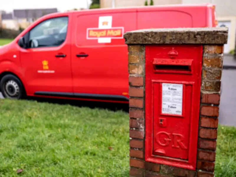
Royal Mail has issued guidance for anyone who handwrites addresses on letters and parcels to ensure proper delivery. The postal service emphasised that handwriting should be "clear and easy to read" on all written labels or packages.
Ink and envelope advice
Royal Mail advised customers to ensure ink stands out clearly against the envelope or parcel, stating: "It's important that the address shows up against the colour of your envelope." Black ink provides the strongest contrast, particularly on white envelopes or address labels. Customers using dark, brightly coloured or patterned envelopes should use plain white labels to make addresses easier to see.
Address layout and format
Addresses should be positioned towards the bottom left-hand side of the front of an envelope or parcel, with postage in the top right corner. The address should be left-aligned rather than centred, with reasonable space around it.
The recipient's name should come first, followed by property number and street name, then local area or village, and town in capital letters. The postcode should be written on the final line in capital letters, with Royal Mail stating: "Write the address clearly on the front, following our guidelines, and always include a postcode if possible."
Impact on delivery
The guidance aims to help ensure addresses remain readable throughout the sorting and delivery process. Taking extra care with clear handwriting, contrasting ink and proper layout can help make letters and parcels easier to process.