If your social media feeds are filled with bold paint choices, you are not alone. The era of expressive colour continues, but a new, more nuanced technique is emerging as the favourite for those in the know. Meet colour capping, the design insider's secret for adding depth, height, and a touch of luxury without overpowering a room.
To decode this growing trend, we spoke to Marianne Shillingford, Creative Director and Colour Expert at Dulux, who has long advocated for expressive colour use in our homes.
What Exactly Is Colour Capping?
You have likely heard of colour drenching, where a single shade covers everything from the skirting boards to the ceiling. Colour capping evolves this idea with greater subtlety.

‘Colour capping has spiralled from the colour drenching trend, which is a technique I’ve loved for a long time,’ explains Shillingford. ‘Where colour drenching coats every last inch of your room in one colour, colour capping incorporates different tones of the same colour in one room, adding the deepest to the ceiling to give it a “capped” effect.’
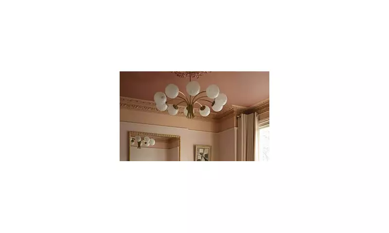
The result is a beautiful gradient that naturally draws the eye upward. This creates an impression of more height, introduces elegance, and adds a surprising dose of drama. It sits perfectly between colour drenching and double drenching, offering a softer and more seamless transition. Crucially, it celebrates a part of the room we often neglect: the ceiling.
‘It’s time we give ceilings the attention and love they deserve!’ Shillingford adds.
The Key Benefits of This Design Technique
If you love the immersive feel of colour drenching, colour capping offers that same enveloping quality but with added dimensionality.
‘It works really well in rooms where you want the sensory nature to be heightened,’ says Shillingford. ‘Use it to surround yourself with calming nature-inspired tones in relaxing spaces or with energising shades in home offices or gyms.’
The true magic of this trend lies in its ability to manipulate perception. Because the darkest tone is placed on the ceiling, your gaze is naturally drawn upwards. This creates a sense of soaring height, making it an ideal solution for rooms that feel a little flat or compact. Meanwhile, using lighter tones on the walls can help brighten a space and add a subtle, welcoming glow.
When Should You Avoid Colour Capping?
As transformative as the technique can be, Shillingford is quick to note that colour capping ‘can’t work miracles’.
Rooms that lack natural light can be tricky to get right. ‘Finishing a dark room with a dark ceiling can make it feel more hemmed in,’ she warns.
Architecturally busy rooms also benefit from a simpler approach. If your space features detailed doorways, ornate mouldings, or many layered textures, introducing multiple tones—even within the same colour family—can tip the balance from interesting to overwhelming. In these cases, a more unified colour drench might be the better choice.
How to Choose Your Colour Capping Palette
Creating the perfect tonal gradient starts with selecting shades that feel inherently connected. A good method is to begin with the colour you want on your walls, then look for one or two steps deeper in the same colour family for the ceiling.
Most paint colour charts and digital tools group these tonal shades vertically, making it easier to visualise how your palette will transition from wall to ceiling.
Texture is another important factor. Soft matte or eggshell finishes enhance the enveloping quality of colour capping, creating a smooth gradient that feels elegant rather than overpowering.
For inspiration, Shillingford suggests a few powerful pairings. A deep purple like Wild Blackberry on the ceiling with a softer lavender such as Violet Night on the walls creates a cosy, dusk-like cocoon. For a more grounded feel, a rich green ceiling in Mallard Green paired with walls in Green Oxide mimics the calming sensation of being surrounded by nature—perfect for spaces where focus or relaxation is key.

Common Mistakes to Steer Clear Of
‘The key to becoming a master at colour capping is keeping to that one tonal family,’ Shillingford emphasises. Straying too far from your base shade can create a jarring, disjointed effect instead of a seamless flow.
Aim for shades that are only slightly lighter or darker than one another. For a polished, cohesive finish, carry these tones through your woodwork using an eggshell paint.
Finally, always test your colours in the actual room where they will be applied. Lighting can dramatically change how a colour appears.
‘This trend is loved for its enveloping effect, so if the shades appear different in your lighting compared to the store, it becomes very noticeable – especially with darker colours,’ Shillingford concludes.