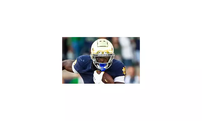
The hallowed grounds of Notre Dame football are shaking, but not from the roar of the crowd. A storm of controversy has erupted after the prestigious university unveiled a subtle yet seismic redesign of its iconic interlocking 'ND' logo, a symbol revered by its global legion of fans.
The change, while not a complete overhaul, has sent shockwaves through the college football world. The beloved mark, a staple on golden helmets for decades, has been meticulously altered. The most noticeable tweaks are visual: a refinement of the letterforms' thickness and a slight adjustment to the negative space where the 'N' and the 'D' intersect.
A Fierce Fan Debate Erupts Online
The announcement on social media was met with an immediate and visceral reaction. The fanbase, known for its deep tradition and passion, is starkly divided. Online forums and comment sections have become a battleground between purists and modernists.
One camp vehemently opposes the change, viewing any alteration to the classic emblem as sacrilege. Comments ranged from 'This is an absolute travesty' to 'If it ain't broke, don't fix it', with many fans accusing the athletic department of unnecessarily meddling with a perfect design.
Conversely, a portion of the supporters have applauded the update. They argue the logo has been given a sleek, modern refresh that maintains its heritage while looking sharper on modern digital platforms and high-definition broadcasts. For them, it's a welcome evolution for a contemporary brand.
Tradition vs. Modernity at a Crossroads
This debate strikes at the very heart of Notre Dame's identity. The university is steeped in tradition, and its football program is a living museum of college football history. Any change, however minor, is scrutinised under the intense lens of its storied past.
The athletic department has yet to release a detailed statement on the reasoning behind the redesign, but it is widely believed to be part of a broader brand modernization effort. The new logo is expected to be rolled out across all team merchandise, uniforms, and official communications for the upcoming season.
Whether this update will be accepted as a new chapter in Notre Dame's visual history or rejected as a misstep remains to be seen. One thing is certain: the fight over a few pixels has proven that for the Notre Dame family, tradition is everything.


