Welcome to The Crunch: A Fortnightly Exploration of Data and Trends
Hello and welcome to another edition of The Crunch, your fortnightly newsletter delving into compelling charts and insights from around the globe. This week, we bring you a deep dive into Australian bushfires, examine the growing disconnect between bosses and workers over artificial intelligence, and marvel at a visualisation of extraordinary financial accumulation. Stay tuned for more charts on heatwaves, American exceptionalism, and urban weather comparisons.
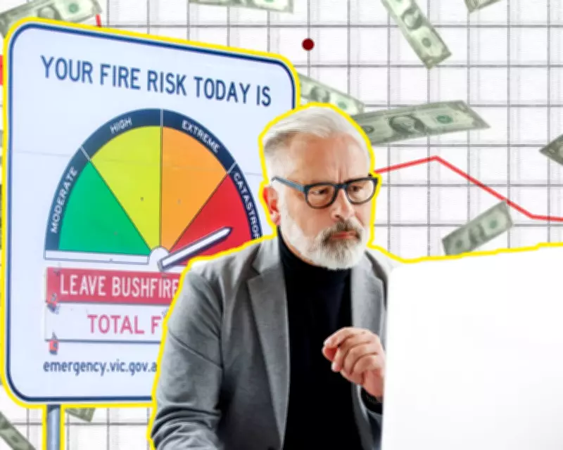
A Deep Dive into Australian Bushfire Devastation
With months remaining in the bushfire season, Victoria has already witnessed hundreds of thousands of hectares burned and hundreds of homes destroyed. The fires that erupted in early January have caused widespread devastation, prompting a closer look at their spread and impact. Animated wind and temperature maps, alongside other visual tools, illustrate how these fires rapidly expanded, highlighting the severe consequences of such events.
In related coverage, our colleagues in the UK have produced a series of maps demonstrating how wildfires are increasingly consuming global forests, largely driven by climate change. Additionally, the ABC has highlighted the diverse data sources, beyond just satellites, used to compile real-time bushfire information, showcasing the complexity of monitoring these disasters.

Charts from the Fortnight: Key Insights
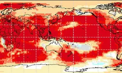
1. The Escalating Threat of Heatwaves
The severe heatwave that struck south-eastern Australia in early January was made five times more likely due to climate change, according to analysis by climate scientists. To make this tangible, the ABC presented a simple yet effective graphic illustrating the increased frequency and intensity of such events. Heatwaves pose significant dangers, and an illustrated story from the ABC explains why they are particularly hazardous, emphasising the urgent need for climate action.
2. The AI Enthusiasm Gap: Executives vs. Workers
A survey from an AI company, though to be taken with caution due to limited methodological details, reveals a stark divide in perceptions of artificial intelligence. Charted by the Wall Street Journal, the results show that C-suite executives are far more likely to report time savings and excitement about AI, whereas workers express higher levels of anxiety and feeling overwhelmed.
This disconnect suggests that those in managerial roles, who frequently engage in tasks like email writing and presentations, may view AI more favourably, especially if job security is not a primary concern. However, the WSJ article also notes that any time saved through AI might be offset by the need to correct errors, particularly in accuracy-sensitive roles.
3. American Exceptionalism in Data
Amanda Shendruk, a Guardian alumna, has crafted a beautifully designed series of charts showcasing the many ways America stands out as an outlier. From a lack of nationally mandated parental leave to lower trust in government and varied life expectancy metrics, these visualisations provide a nuanced look at the country's unique socio-economic landscape.
4. A Torrent of Financial Gains
Since retaking the presidency, a political figure has amassed a staggering amount of money—16,822 times the median US household income, as reported by the New York Times. A dynamic graphic depicts this wealth as stacks of bills raining down, with each stack representing the median income. The visual effectively conveys the scale of financial accumulation from sources like media settlements and crypto sales, with design elements that enhance the impact.
Bookmarks and Off the Charts
This week's bookmarks include an illustrated piece on Singapore's transformation, reflections on cultural references in music, and initiatives in data visualisation. Additionally, a 3D weather chart by Arthur Juliani has sparked discussion in data visualisation circles. Juliani argues that this format, with temperature on the Y-axis and a continuous curve, offers improved readability compared to traditional line or polar charts. For comparison, a polar chart of temperature averages in Sydney and Melbourne is provided, inviting readers to share their opinions on optimal weather chart formats.

If you enjoy The Crunch, consider forwarding this email or sharing the sign-up link with others who might appreciate these insights. Explore more on related topics and stay informed with our fortnightly updates.