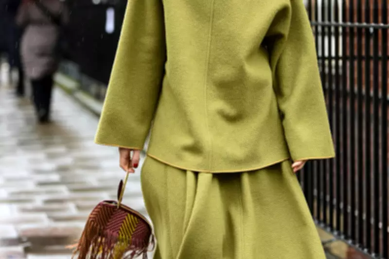
Forget butter yellow and powder pink – 2026's breakout colour is set to be far punchier, and harder to pull off. Chartreuse, the divisive yellow-green blending lime, mustard, and neon, has unexpectedly become fashion’s latest obsession.
The high-impact shade drenched models on spring/summer 2026 runways for Prada, Saint Laurent, Erdem, and Valentino. Off the catwalk, stars like the Duchess of Sussex and Emma Chamberlain have already embraced the trend.
Shoppers are following suit, with Clearpay data showing surging searches and purchases for chartreuse pieces. Year-on-year, chartreuse green trousers are up 132%, jackets 89%, and tops 12%.

More arresting than the usual spring palette of pale blues and blush pinks, chartreuse feels energetic, optimistic and impossible to ignore.
Why Chartreuse Works
“There is an energy and confidence in the colour,” says fashion designer and podcaster Amanda Wakeley OBE, “and it has a freshness that instantly lifts the complexion and the mood, which feels very right for now and for summer.”
The good news is that despite its intimidating reputation, chartreuse is surprisingly wearable – if you know how to style it.
Start Small
If head-to-toe chartreuse feels too bold, Wakeley recommends weaving the colour into pieces you already wear regularly. “You do not need to wear it head to toe. Why not experiment with a beautiful silk shirt or a cashmere sweater … maybe even a suede shoe or bag in this luxurious hue?”
The easiest way to make the trend feel cool – rather than overwhelming – is to treat chartreuse like an accent colour, similar to how the ‘pop of red’ trend was styled. A chartreuse blouse with relaxed blue denim, or a satin slip skirt paired with a crisp white shirt, instantly feels fresher without trying too hard.
Match the Undertone to Your Skin Tone
While you may think chartreuse is just one colour, Wakeley says anyone can make it flattering as long as you choose the right version of the shade. “There’s a version of chartreuse for everyone, it’s about finding the right depth and undertone,” she explains. “Warmer skin tones tend to look beautiful in a more golden-based shade, while cooler skin tones often suit chartreuse with slightly bluer undertones.”
If you’re hesitant, she suggests keeping the colour away from the face initially. “A skirt, trouser, handbag or shoe can still give that injection of colour without feeling overwhelming.”
Pair It with Rich Neutrals
When paired with chartreuse, anything too light like beige or stone isn’t very flattering and can cheapen the near-neon shade. The bold shade actually pairs surprisingly elegantly with classic wardrobe staples. Wakeley says she particularly loves the shade styled with “chocolate brown or charcoal grey … because those tones ground it beautifully”.
These softer or deeper neutrals stop the colour veering into neon territory and make it feel significantly more wearable and sophisticated for day-to-day dressing. For eveningwear, chartreuse satin or silk paired with black tailoring creates a surprisingly sleek contrast that feels more Saint Laurent than sportswear.
Don’t Be Afraid of Contrast
While chartreuse can be softened with rich neutrals, it also works brilliantly with equally bold shades. Fashion’s renewed appetite for expressive colour means unlikely combinations are suddenly feeling chic again. Chartreuse with cobalt blue, poppy red, lilac or rich violet have all been spotted on the runways.
Wakeley agrees that fashion is entering a more experimental phase. “I think we are in a moment when just about anything goes in terms of colour combinations. Indeed if you want to add an edge to your look right now, go for those really unusual colour combinations … the higher the contrast the better.”
Gold or Silver?
Accessories can make or break a bold look, but knowing which ones to opt for will depend on your undertones. If you have cool undertones, wearing chartreuse with silver jewellery will be far more flattering than gold – and vice versa. “Gold jewellery tends to enhance its warmth, while silver can give it a sharper edge,” Wakeley explains.

Minimal styling is usually best when working with a colour of this contrast. Because chartreuse already carries so much visual impact, clean silhouettes and simple accessories help the shade feel elevated rather than overpowering.