Amazon Logo's Hidden 'A to Z' Arrow and Smile Detail Stuns Shoppers
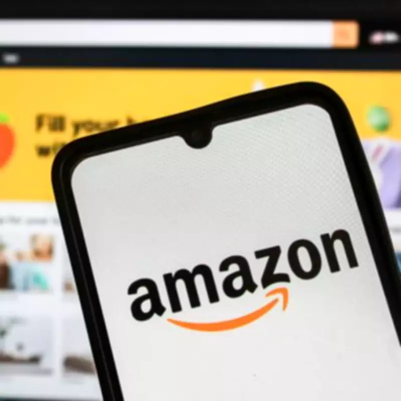
Amazon has maintained the same iconic logo for over 26 years, yet shoppers are only just uncovering the 'genius' hidden details embedded within its seemingly simple design. The current logo, introduced in January 2000, features the company name in lowercase black letters with a slightly angled yellow arrow beneath, but its deeper meanings are now sparking widespread fascination.
The Dual Symbolism of the Arrow
The modern Amazon logo is instantly recognisable across more than 25 countries where the e-commerce and streaming giant operates. However, beneath its straightforward appearance lie two specific Easter eggs that convey a profound message about the brand's ethos.
The first detail is the arrow's resemblance to a smile. Design experts explain that this is intentionally crafted to reflect a smiling customer who has enjoyed a positive experience with Amazon. This subtle element aims to build trust and reinforce the company's customer-centric approach, making the logo not just a visual marker but a psychological tool.

The 'A to Z' Revelation
The second, less obvious detail involves the arrow's placement. It starts at the letter 'A' in Amazon and points directly to the letter 'Z', symbolising that the company offers everything from A to Z. This clever design choice was recently highlighted in a Reddit 'Today I Learned' forum, where a user shared their discovery, prompting a wave of similar realisations.
Many have theorised that this dual symbolism—representing both a comprehensive product range and customer satisfaction—makes the logo exceptionally clever. It encapsulates Amazon's promise of a reliable, all-encompassing shopping experience, launched with the logo in 2000 to mark a new era for the brand.
Public Reaction and Comparisons
The revelation has ignited lively discussions online, with some speculating it was inspired by a recent episode of the US quiz show Jeopardy, where contestants were quizzed about the arrow's meaning. Comments flooded in, with users expressing amazement at the hidden depth.
One user remarked, "I always thought it was a smile. Like a little smirk," to which another replied, "It's both. Therefore, it's clever." Others drew parallels to other iconic logos, such as the FedEx logo, which hides an arrow in the negative space between the 'E' and 'x' to denote speed and precision.
This discovery underscores how brand logos often conceal intricate meanings, with companies like Adidas also embedding hidden symbols in their designs. Amazon's logo, with its dual message of customer joy and infinite selection, stands as a testament to thoughtful brand identity that continues to engage and surprise consumers decades after its debut.