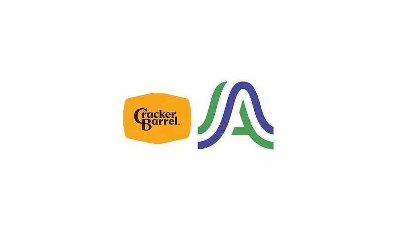
In a move that has sent shockwaves through its devoted customer base, the beloved American restaurant chain Cracker Barrel Old Country Store has unveiled a radical new brand identity, stripping away the iconic barrel from its logo for the first time in over five decades.
The new design, a stark departure from its folksy heritage, features a simplified, modern typeface for the 'Cracker Barrel' name, with the words 'Old Country Store' placed neatly underneath. The most conspicuous absence is the classic wooden barrel and the mallet that have been synonymous with the brand since its inception in 1969.
A Clash of Tradition and Modernity
The company, headquartered in Tennessee but with its creative agency based in Austin, Texas, is framing the change as a necessary evolution. The goal is to present a more contemporary and versatile image that resonates across physical restaurants, digital platforms, and retail packaging.
However, the reception from long-time patrons has been far from welcoming. The announcement on social media was met with an immediate and fierce backlash. Loyal customers flooded platforms like Facebook and X (formerly Twitter) to express their dismay, labelling the redesign as "soulless," "generic," and a blatant disregard for the chain's cherished history.
Customer Outcry and Nostalgic Fury
Many critics compared the new, minimalist logo to something created on a basic word processor, with one user quipping it looked like it was "designed in Microsoft Word by a 10-year-old." Others accused the chain of abandoning its identity and the rustic, country charm that made it a staple of American dining.
The sentiment was overwhelmingly negative, with comments such as "Why fix what isn't broken?" and "This is a huge mistake" dominating the conversation. For a brand built on nostalgia and a sense of familiar comfort, the redesign has risked alienating its core audience in pursuit of a new, uncertain one.
The Strategy Behind the Shift
Despite the public furore, branding experts suggest such a dramatic change is often a calculated risk. Companies frequently aim to refresh their image to attract younger demographics and ensure relevance in a competitive market. The old logo, while rich in heritage, may have been considered too detailed and dated for effective use on digital and small-scale applications.
Only time will tell if Cracker Barrel's gamble will pay off. The company will be hoping that the quality of its Southern-style cooking and the in-store experience will eventually overshadow the controversy. But for now, the chain finds itself in a precarious position, caught between honouring its past and navigating its future.