Thinking of giving your home a fresh coat of paint? You might want to think twice before reaching for that trendy tin - your colour choices could be costing you thousands of pounds when it comes time to sell.
The Property Value Killers
According to property experts, certain paint colours can dramatically reduce buyer interest and ultimately lower your home's market value. While personal taste varies, there are clear patterns in what potential purchasers find off-putting.
Colours to Avoid at All Costs
- Bold Reds and Oranges: These intense shades can overwhelm small spaces and create an aggressive atmosphere that turns buyers away
- Dark Browns and Greys: While fashionable in moderation, dark colours can make rooms feel smaller and depressingly dim
- Bright Neons: Electric greens, pinks and yellows might express personality but they scream 'repainting project' to potential buyers
- Overly Trendy Colours: What's fashionable today often looks dated tomorrow - and buyers can spot yesterday's trends a mile away
The Winning Colour Palette
So what should you choose instead? The secret lies in creating a neutral, sophisticated canvas that allows buyers to imagine themselves living in your space.

Room-by-Room Guide to Value-Boosting Colours
Living Rooms
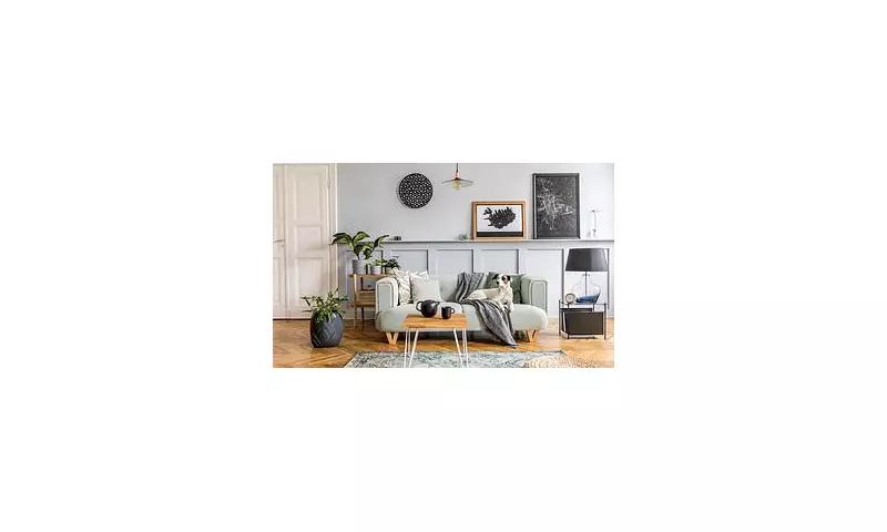
Opt for warm, light neutrals like soft greige (grey-beige), warm white or pale taupe. These colours create a welcoming, spacious feel that appeals to the broadest range of buyers.
Bedrooms
Choose calming, restful shades like soft blues, gentle greens or lavender-grey. These promote a sense of tranquillity that buyers find immediately appealing.
Kitchens
Crisp whites, soft greys and pale blues work wonders in kitchens, suggesting cleanliness and modernity while making the space feel bright and airy.
Bathrooms
Stick to spa-like colours: clean whites, pale aquas and soft stone shades create a fresh, clean appearance that buyers associate with luxury.
Why Neutral Doesn't Mean Boring
The key to successful neutral decorating lies in texture and subtle variation. Rather than plain magnolia, today's value-boosting neutrals include sophisticated shades like:
- Farrow & Ball's Setting Plaster: A warm pink-based neutral that adds character without overwhelming
- Little Greene's French Gray: A timeless green-grey that works in both traditional and contemporary homes
- Dulux's Timeless: A complex neutral that changes with the light, creating depth and interest
Remember, when it comes to property value, your personal colour preferences should take a back seat to what appeals to the average buyer. A simple repaint in the right shades could add significant value to your home - while the wrong choice could see it languishing on the market for months.
Before you next visit the DIY store, consider this: the £50 you save on that bold bargain paint could end up costing you thousands in reduced offers. Sometimes, playing it safe with colour is the smartest financial decision you can make for your property.