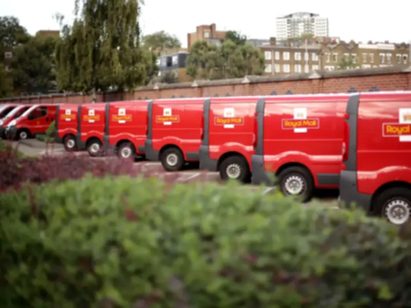
Royal Mail has issued guidance on the correct way to address a letter or parcel, emphasising the importance of using black ink for clear readability. The service, which handles up to 6.6 billion letters annually, relies on automated sorting machines that require addresses to be clearly visible.
Why black ink is recommended
Royal Mail advises using clear and easy to read handwriting or font when addressing mail. Black ink is specifically recommended for optimal readability, particularly on lighter surfaces or labels. The service suggests using a white label with black ink if the envelope colour is dark.
Light or faded ink colours, such as light grey, pale yellow, or faint pink, should be avoided as they can blend into the envelope background. Writing tools that smear or blur easily during automated sorting should also not be used.
Correct address format
The recipient's name should appear on the first line, including both first name and surname. The property number and street name go on the next line, followed by the local area or village name. The town name should be written in capital letters, with the county being optional. The UK postcode must appear on the final line in capital letters, with the country name added for international destinations.
Royal Mail reminds customers to always include a postcode where possible, offering a free Postcode Finder service for up to 50 searches.