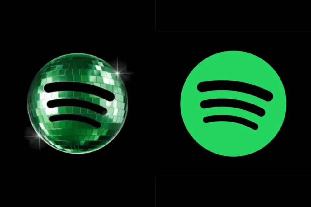
Spotify's temporary disco-ball icon, introduced to celebrate the platform's 20th anniversary, has provoked a strong negative reaction from users. The streaming service acknowledged the backlash and confirmed that the original logo will return next week as planned.
The glowing green mirrorball icon appeared without warning on the iOS app last week, part of a mobile-only experience called 'Spotify 20: Your Party of the Year(s)' that allows users to revisit their listening history. However, many users criticised the design, with some calling for the designer to be fired and others describing the app as 'ugly'.
Spotify responded to complaints on social media, stating: 'We know glitter is not for everyone. Our temp glow up ends soon. Your regularly scheduled Spotify icon returns next week.' The company also noted that the birthday icon was a 'limited-time guest star'.
Critics pointed out readability and branding issues. Social media consultant Jack Appleby said the icon had 'huge readability & brand issues', citing a different shade of green that is 'too dark against the black' and a pixelated texture on small screens. Spotify replied: 'It's our birthday so we're in our party gear, but we'll be back to normal when the lights go down.'
Not all feedback was negative. Michael J. Miraflor of WPP's EssenceMediacom defended the temporary change, saying: 'Look what you've done, dorks. You've bullied Spotify into reversing something fun and different (and temporary to begin with) for their 20th Anniversary. We don't deserve nice things.'