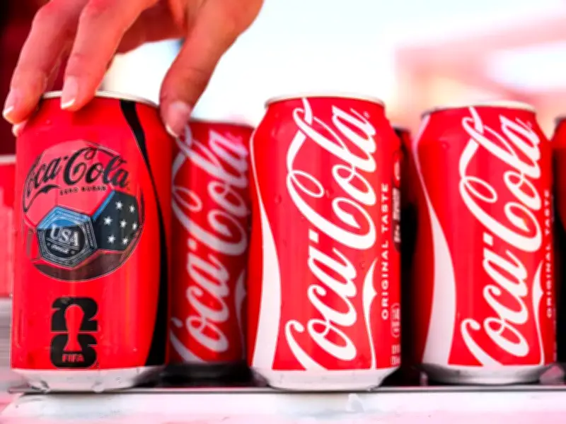
A branding expert has pointed out a subtle detail in the Coca-Cola logo that many people have missed for years. Richard Lau, president of LOGO.com, a company that specialises in logo design, suggests that the long sweeping tail under the “C” may not just be decorative. Some believe it resembles a smile, which aligns with Coca-Cola’s “happiness” message.
The Hidden Smile in the Logo
Lau explained: “This subtle message may go unnoticed, but it subconsciously creates a positive association with the brand in the minds of consumers.” Whether the smiley effect was intentional when the logo was first created or not, the brand has been able to play on it, such as with the 2009 “Open Happiness” campaign.
The hidden smile has sparked discussion online, particularly on Reddit. Many users expressed appreciation for the detail, with one cola fan calling it the “perfect logo”. Another user commented: “Ever since someone told me about the faces in the logo I can't unsee it whenever I look at it.” A third user suggested the logo’s longevity is due to its appeal, saying: “Coca-Cola is a cool logo, that's why they didn't change it.”
History of Coca-Cola and Its Logo
Coca-Cola originated in Atlanta, Georgia, in the late 1800s. The drink is widely credited to pharmacist John Stith Pemberton, who created a syrup designed to be mixed with carbonated water and sold at soda fountains. It was first served in 1886, a time when pharmacies often sold fizzy “tonics” and remedies.
A key turning point came when businessman Asa Griggs Candler acquired the rights and helped turn Coca-Cola into a nationwide business through heavy promotion, wider distribution, and memorable advertising. The branding was important from the start; “Coca-Cola” was chosen because it was catchy and looked good written down, and the flowing script helped turn the name into a recognisable logo.
While many brands have changed their look over the years, Coca-Cola has mostly stuck with what works, making small refinements rather than big changes, which is a big part of why people are still fascinated by the logo today.