TV body language expert Judi James has analysed the new Premier League shirts for the 2026/7 season, revealing the secret messages behind each design. From Arsenal's "scary" blood-red to Newcastle's "aunt's pyjamas" look, here is what your club's strip says about their chances.
Arsenal's Threat and Villa's Northern Soul
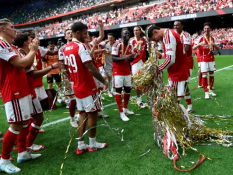
Arsenal's shirt is "deep, rich, blood-red and psychologically scary-looking", according to James, with a "Liam Neeson-level threat vibe" that signals success and should create "entitled confidence". Aston Villa's claret and blue retro number has a "whiff of Northern Soul", tying in with the "loud and proud" resurgence of anywhere north of Watford.
Bournemouth's wide black and deep red vertical stripes are a "meaningful signal of intent" that should intimidate, with a black neckline suggesting tough play. Brentford's bold red and white stripes show confidence, while the black/yellow collar and cuffs suggest a "hard-worker bee attitude".

Business-like Brighton and 80s Chelsea
Brighton's solid rich blue shirt with white pin stripes suggests a business-like approach, while the angular neckline projects aggression and digging in. Chelsea's kit echoes 80s power-dressing, with shoulder strength indicating a desire to attack rather than defend.
Coventry's wide mottled blue and white stripes appeal to the calm, logical side, suggesting a more forensic approach. Crystal Palace's "box of washing powder look" has a sash that suggests a desire to win, but its freshness might belie a lack of sophistication.
Everton's Nostalgia and Fulham's Thames Tribute
Everton's simple kit nods to Liverpool's docklands, helping root them in tough times, with a flash of amber and yellow suggesting surprise. Fulham's homage to the Thames features diagonal ribbing for fluid play, but the black and red neckline shows a desire for discipline.
Hull City's old-school orange and black stripes with white collar and cuffs are "retro, stylish" and suggest staying power. Ipswich's royal blue shirt with embossed diamond pattern is calm and thoughtful, but may not inspire greatness.
Leeds' Trojan Horse and Liverpool's Fireworks
Leeds' "fussy" look is a potential Trojan Horse, with opponents underestimating them before they "run rings round the opposition". Liverpool's retro design features "fireworks going off", combining stability and experience with new fizzing energy.
Man City's fade from sky blue to white echoes Erling Haaland's ice-cool attitude, with an air of "Viking style invincibility". Man Utd's mod collar and shoulder stripes show loyalty, bravery and physical power, presenting them as "happy warriors".
Newcastle's kit resembles "a pair of pyjamas your auntie buys you", but wearing them with pride and arrogance could help them handle anything. Nottingham Forest's red mist effect suggests they are "primed and ready to go" with controlled anger. Sunderland's nod to their 1937 FA Cup includes a subtle S from the cup handles, suggesting a playful attitude alongside their Elvis-inspired pink away kit.
Spurs' blank canvas could allow them to start from scratch and foster creativity. Celtic's shamrock green and white stripes create calm, stress-free energy, with a rugby-like air of physical intimidation. Rangers' chic blue kit with thin white stripes and red/white collar promotes confidence, pride and focus.