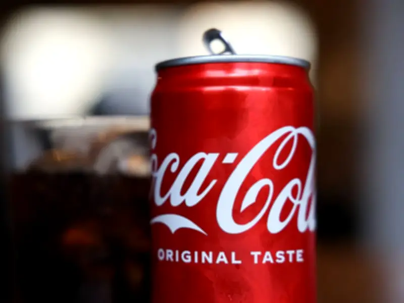
Coca-Cola's iconic logo contains a subtle detail that many consumers have overlooked for decades: the sweeping tail under the letter 'C' is widely believed to represent a smile, underlining the brand's focus on happiness and joy.
Richard Lau, president of LOGO.com, an industry leader in logo design, said the tail isn't just decorative. Marketing expert Richard added: "This subtle message may go unnoticed, but it subconsciously creates a positive association with the brand in the minds of consumers."
Brand's use of the smiley feature
While the 'smiley face' detail may not have been intentional when the logo was first drawn up, it's a feature the brand has since used to its advantage. For example, the 'Open Happiness' campaign of 2009 pairs perfectly with the logo.
Discussion about the logo was sparked on Reddit, where plenty of people said they were keen on the smiley design. One fizzy drink fan even described the design as the "perfect logo".
Meanwhile, another said: "Ever since someone told me about the faces in the logo I can't unsee it whenever I look at it." And speaking about how the graphic has stood the test of time, a third added: "Coca-Cola is a cool logo, that's why they didn't change it."
History of Coca-Cola and its famous logo
Coca‑Cola started in Atlanta, Georgia, in the late 19th Century. The original drink is widely credited to pharmacist John Stith Pemberton, who developed a syrup that could be mixed with carbonated water and sold as a fountain drink. It was first served in 1886 at a soda fountain in Atlanta, when pharmacies commonly sold fizzy “tonics” and remedies alongside everyday goods.
In the early years, the business evolved from a small local product into a scalable brand. A crucial turning point was the involvement of businessman Asa Griggs Candler, who acquired rights to the formula and brand and built it into a larger company through aggressive promotion and distribution. Under Candler, Coca‑Cola expanded beyond a single soda fountain product to a widely sold beverage, supported by advertising and consistent branding.
The brand name “Coca‑Cola” itself was designed to be memorable and visually striking, with the two words sharing the same initial letter and rhythm, making it easy to spot and to say. Early on, the name was rendered in a flowing, cursive style that became closely associated with the product – effectively turning the written name into a recognisable symbol in its own right.
Over time, this script look helped Coca‑Cola build a consistent “signature” across posters, shop signage and later mass advertising, so that even partial glimpses of the lettering could signal the brand.
Continuity over change
While many major brands regularly overhaul their visual identities, Coca‑Cola has tended to protect the continuity of its logo, refining rather than replacing it. That’s a big reason people still find the logo so interesting today.