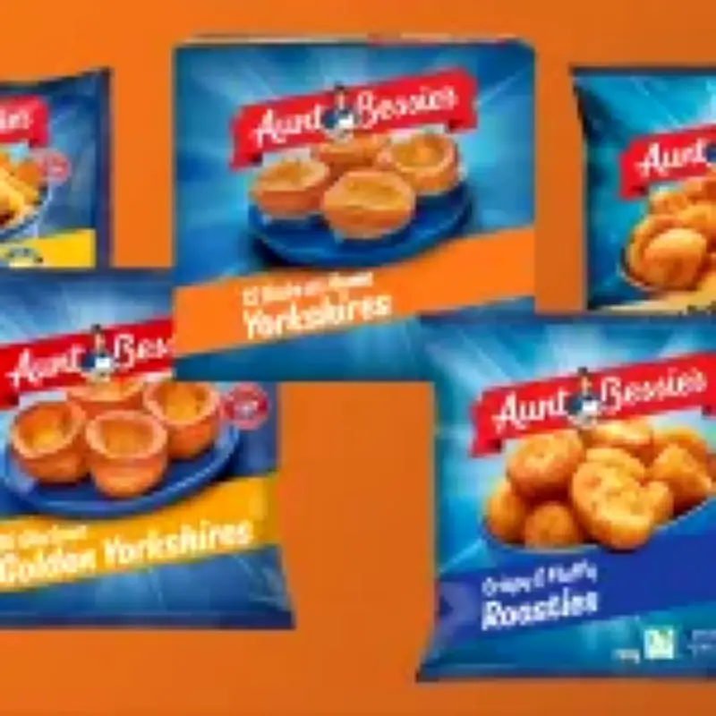
Aunt Bessie's, the British frozen food brand known for its Yorkshire puddings, has unveiled a major logo redesign, marking the biggest change since the character first launched in 1995. The iconic grandmotherly figure, who has smiled from packets for over 30 years, has had her signature mixing bowl and wrinkles removed in a 'glow-up' described as 'fresher-faced' and 'more contemporary'.
Instead of cooking, the new Aunt Bessie is depicted as 'open-armed and ready to serve up Yorkshire puddings, roast potatoes, honey-glazed parsnips, and many more of the nation's favourites.' The redesign was created by 1HQ Netherlands, who shared a closer look on Instagram, explaining it was meant to show a 'warmer, more welcoming Aunt Bessie', adding that she sits at the heart of every pack 'as if serving you personally'.
Changing roast dinner habits
Aunt Bessie's says these changes come at a time when the way we eat roast dinners is 'shifting'. The meal is no longer reserved only for Sunday, with four in 10 Brits now cooking Yorkshire puddings whenever they feel like it. A spokesperson for the brand added: 'While her appearance may have changed, underneath it all, she's still the same Aunt Bessie that families trust and can rely on'.
However, marketing experts aren't entirely convinced. Dr Sabrina Gottschalk, a lecturer in marketing at Bayes Business School, believes the brand will lose some trust because of these changes. 'What's interesting about the Aunt Bessie character redesign is that she has not just been made younger, but her role in the brand seems to have changed,' she tells Metro. 'The old Bessie with the mixing bowl was very much the cook who signalled experience and homemade food.'
Mixed fan reactions
'The new Aunt Bessie feels more like the host. With her open arms, she seems to be as much about bringing people around the table as about the food itself. That makes sense if roast dinners are changing too. People aren't necessarily sitting down for the traditional Sunday roast in the same way and tend to eat Yorkshire puddings for all sorts of meals,' Dr Gottschalk continues. 'Making Aunt Bessie feel younger and more open may help the brand move beyond a traditional Sunday lunch image, but the trade-off, of course, is losing some of the familiarity and trust that came with the original character.'
Reactions to the new logo have been mixed, with some fans upset that Bessie has been 'replaced by a younger model' and others embracing the change as the character is now 'fit'. Taking to Facebook, Meirion Woolf shared an impassioned post about it, writing: 'It is a real shame to see the classic Aunt Bessie pushed into retirement for a younger model. Erasing a familiar, grandmotherly face from the freezer aisle just feeds into the modern narrative that aging is something to hide or replace. We should be celebrating older generations and the warmth they represent, not airbrushing them away for a corporate glow-up.'
However, others have commented on Instagram that the new design 'looks brilliant' and 'incredible' with @made.by.simon even joking that Aunt Bessie is now 'fit'.