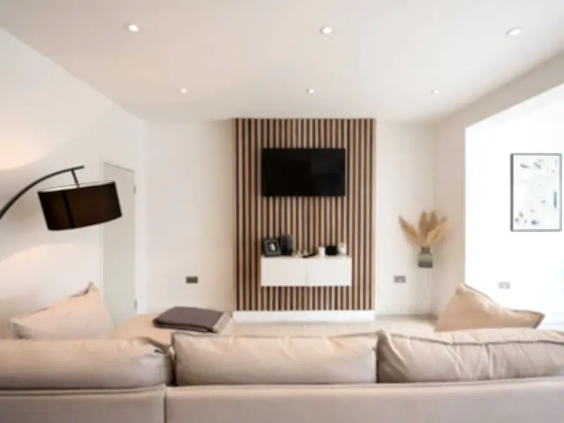
A woman who ignored warnings not to redecorate her living room in beige has said she has no regrets, claiming the room now looks more “expensive” than when it was plain white.
The homeowner, who shares content under the handle @thebellahome on TikTok, decided to go ahead with the colour change despite people telling her she would “regret it.” She said she was glad she listened to her heart.
Reaction to the colour choice
Some people were puzzled by the shade she had chosen, describing it as a unique beige. Against the backdrop of the carpet, it initially did not look very inspiring. However, when the results of the makeover were shown on camera, it was clear the correct decision had been made, as the living room did look “expensive.”
She captioned the video: “POV: You finally find the beige that makes your whole living room look more expensive. I wanted something warm, timeless, and cosy, without making the room feel darker...and I think this might be THE one”.
What others said
Commenters praised the colour, with one person saying, “You can barely go wrong with this colour,” hinting they preferred it to white. Others described it as “elegant” and “too beautiful,” noting the beige tone even looked slightly like a “honey” colour. Some said they wanted to copy the decor in their own homes, calling it their “dream space.”
Why beige works
Beige paint creates a high-end, tailored look by reflecting light more softly than stark white and providing a subtle, rich backdrop for furnishings. Unlike stark white, which can look cool or sterile, warm beige contains underlying undertones (yellow, pink, or grey) that bounce natural light gently, softening harsh shadows and creating a glow associated with luxury boutique hotels.
Painting walls, trim, and baseboards in tonal shades of beige can hide architectural flaws, visually raise ceilings, and create an expensive, seamless backdrop. Trend-heavy wall colours quickly date a room when the shade goes out of fashion, while neutral, warm stone tones suggest permanence, restraint, and quiet luxury.