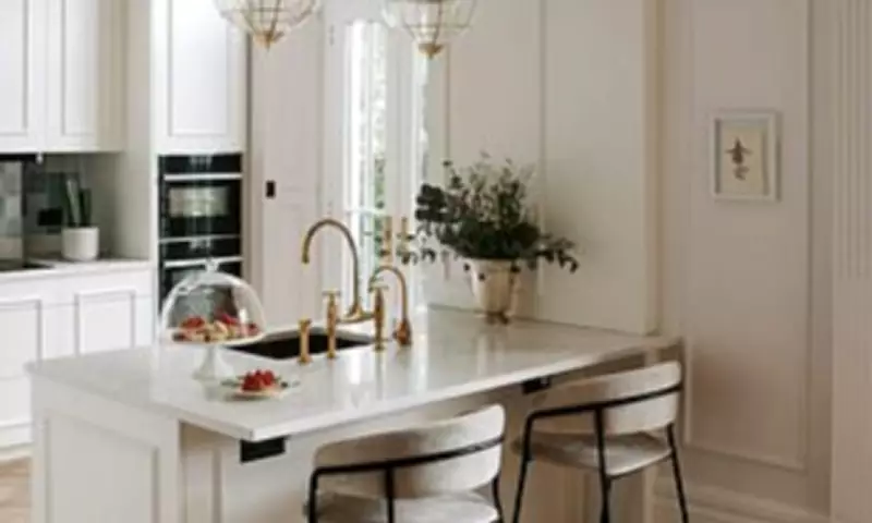
Choosing the perfect white paint is far more nuanced than it first appears. While white is often seen as the safest decorating choice, designers argue it can actually be one of the hardest shades to get right.
The Undertone Challenge
The difference between a white that feels soft, calming and timeless and one that feels stark or clinical often comes down to subtle undertones – whether that's a hint of cream, taupe, pink or grey – and the way those tones shift throughout the day as the light changes.
In recent years, designers have increasingly moved away from brilliant, gallery-style whites in favour of softer, chalkier shades that bring warmth and depth to a space. Rather than acting as a blank backdrop, the right white can shape the mood of a room entirely, making it feel brighter, gentler and more inviting without overpowering the rest of the scheme.

Light and Texture Matter
Light plays a major role in how white paint appears, which is why experts approach it differently depending on the orientation of a room. North-facing spaces tend to amplify cooler undertones, while south-facing rooms can make warmer whites appear creamier than expected. That's why testing samples throughout the day is essential before committing.
Texture is equally important. Without careful layering, white interiors can feel flat or one-dimensional, but paired with warm woods, natural stone, linen and aged metals, they take on a softer and more characterful quality.
We asked leading interior designers and colour experts to share the white paints they return to time and again, the undertones they always look for, and the styling tricks they rely on to make white rooms feel warm, elevated and timeless.
Designers' Favourite White Paints
Louisa Greville Williams, interior designer and founder of LGW Designs, says: 'Farrow & Ball's School House White is the white I return to most because it's warm, versatile and works beautifully across very different spaces. I've used it in open-plan kitchens, north-facing sitting rooms and contemporary flats because it creates a soft backdrop that complements almost any palette without overpowering it. I generally avoid brilliant whites because they can feel too stark, especially in smaller spaces that need more atmosphere and personality. White works best when it supports the rest of the scheme rather than dominating it.'
Dan Lovatt, colour consultant, interior designer and founder of Lovatt Studio, says: 'My current favourite white is COAT Paints' Naptime, a beige-white that combines brightness with the softness of linen. It works particularly well in north-facing rooms, helping counteract cooler light, and I also love using softer whites on ceilings to maximise light reflection. I tend to favour whites with yellow, taupe or pink undertones, which feel far more welcoming than cooler shades. To make white interiors feel layered and personal, I pair them with warm wood flooring, terracotta, colourful artwork and collected objects full of character.'
Holly Lamont, founder and creative director of Holla Design, says: 'My favourite white is Farrow & Ball's Shadow White because it has a creamy warmth that makes spaces feel soft, inviting and full of character. I never gravitate towards brilliant whites as they can often feel flat and lacking personality. Shadow White works especially well in older or more traditional homes and pairs beautifully with deeper shades like olive green, burgundy and dark navy for a timeless layered look.'
Niamh O'Sullivan, founder and creative director of Studio Kiri, says: 'Little Greene's Slaked Lime is my go-to white for open-plan spaces because it creates an airy feel without becoming sterile. It has a subtle warmth that keeps larger rooms feeling soft and welcoming. I use white most often in stairwells, where it creates a gallery-like backdrop for artwork and runners, but I avoid it in small north-facing living rooms or snugs where deeper colours create a far more atmospheric feel.'

Lara Clarke, founder of Lara Clarke Interiors, says: 'My go-to shade is Farrow & Ball's Oxford Stone, which sits somewhere between a warm stone and a soft mushroom. It has far more character than a standard off-white but still feels light and calming, making it perfect for kitchens and living spaces. To keep white schemes feeling warm rather than clinical, I bring in pale oak, honed marble, woven textiles and antique brass, alongside softer tonal furnishings instead of stark contrasts.'
Laura Deller, author of Nailed It! The Essential Guide To Do It Yourself, says: 'My favourite white is Little Greene's Loft White because it gives you a crisp, airy look without the icy undertones often associated with brilliant white paints. I've used it throughout entrance halls, staircases and landings to balance bolder colours and contrasting woodwork. I always recommend testing paint on large sample boards and moving them around the room throughout the day to understand how the light affects it. Paint finish matters too — in high-traffic areas, a durable wipeable formula is essential if you want white walls to stay fresh.'
Katerina Tchevytchalova, founder of K'Arte Design, says: 'Farrow & Ball's Shaded White is my go-to because it has enough warmth and depth to feel soft and welcoming without tipping too yellow. It works particularly well in smaller rooms and shadowy spaces where brighter whites can feel harsh. No white is ever truly neutral, which is why I always encourage clients to test samples directly on the wall and view them under both natural and evening light before making a decision.'
Laura Hammett, creative director of Laura Hammett, says: 'Perfect White from our Laura Hammett Living paint collection is a shade I return to repeatedly because it feels genuinely soft and neutral without appearing clinical. It works beautifully in living rooms, bedrooms and hallways where you want the architecture and furnishings to take centre stage. To make white really come alive, I layer it with aged oak, antique brass, raw linen and tactile plaster finishes, which give the room warmth and softness.'
Rebecca Hughes, creative director of Rebecca Hughes Interiors, says: 'My go-to white is Farrow & Ball's Dimity because it feels soft and warm without ever appearing stark. I particularly love it in ensuite bathrooms, where it creates a bright but calming atmosphere. Cooler whites can quickly feel flat in north-facing or smaller rooms, so I always test samples throughout the day before committing. To stop white schemes feeling one-dimensional, I pair Dimity with veined marble, warm timber and aged brass for added depth and texture.'
Al Bruce, founder of Olive & Barr, says: 'My go-to white is Mylands' Holland Park, a gently creamy shade that feels clean, soft and relaxed rather than stark. I particularly like using it in shaker kitchens and open-plan spaces, where it enhances natural light while keeping the overall scheme feeling warm and welcoming. White works best when it's balanced with contrast and texture, so I pair it with timber cabinetry, stone surfaces, aged brass and tactile finishes like linen or ceramics. I also love combining softer whites with earthy greens, muted blues and deeper cabinetry shades to give the space more depth and definition.'