Newcastle United unveiled their new crest on Thursday morning, ending a 791-day consultation process with supporters and leading industry experts that they believe will open new doors in the marketing sphere.
Rather than radically change the design of the previous badge, Newcastle have refined it, polished up the edges and made it smarter, sharper, cleaner and, crucially, more consistent.
Why the badge was refined
There are thousands of different iterations of the badge around St James' Park alone and the 'intricacies and irregularities' of the previous design, used since 1988, meant it was difficult to replicate at a high quality when it came to merchandising and the club's digital footprint.
The new crest feels very much like the old crest and that is deliberate. Newcastle engaged with 19,500 members and season ticket holders, with 84 per cent of those surveyed wanting the badge to be refined rather than overhauled. A significant majority rejected a circular design.
Fan input shapes the design
A revolution of the badge was never considered, with the example of Juventus replacing their badge with a 'J' being cited by club insiders ahead of the unveiling. The club listened to what the supporters wanted rather than go for a radical re-design.
That meant keeping all elements of the previous crest in the new one, giving the club's chief creative officer Kenneth McIver - a lifelong Newcastle fan who sits in the Leazes End on matchday - a strict brief to work with. McIver has been involved in the kit designs of England, Barcelona and PSG in his previous role as global design director for Nike Football.
Castle becomes key mark
His design process was guided by data collected from supporters. While they overwhelmingly told the club they wanted to retain all elements of the previous badge - the hippocampi, the black-and-white shield, the lion and the flag - they also told them the castle was the most important element, with 55 per cent of respondents making that clear.
That is why the castle has become the 'key secondary mark, signature and device' in a new brand system that chief marketing officer Steven Taylor says opens new storytelling avenues in the marketing sphere that would not have been possible if they switched to a more simplistic design.
The hippocampi is a nod to Newcastle's industrial and maritime legacy, the castle has represented the city for centuries and the shield is linked to the club's 1969 Fairs Cup winning side.
Marketing ambitions
The club feel that not only retains regional pride among the hardcore local support but also allows them to educate new fans globally about what the club represents and the history of which it has been built on.
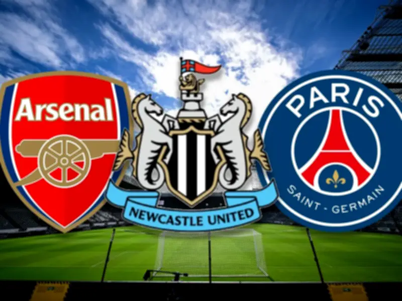
Taylor feels the new design, driven by McIver and his team, will put Newcastle in the same conversation as Arsenal and PSG, who are seen as world leaders when it comes to marketing.
It is another strand of CEO David Hopkinson's long term vision for Newcastle's men and women's teams being able to consistently compete for the Premier League and WSL titles by 2030. It is another example of the 'self-care' Hopkinson believes the club can take to accelerate the process of closing the revenue gap between themselves and the 'big six' clubs in the Premier League.