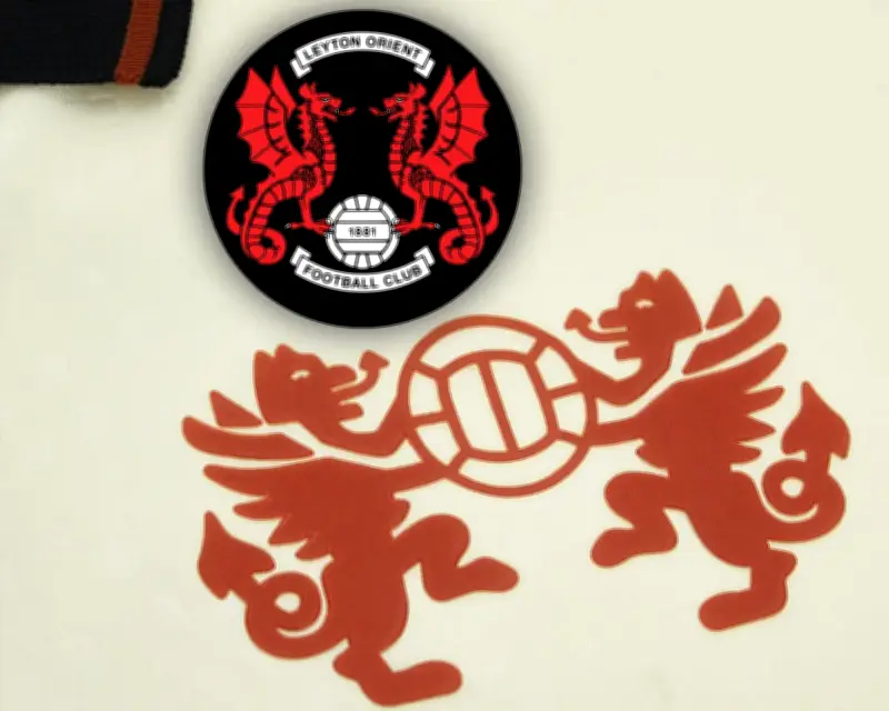
Leyton Orient have publicly challenged Wrexham over the design of their newly unveiled badge, suggesting it bears a striking resemblance to their own crest. The London club took to social media to highlight the similarities, posting a side-by-side comparison of the two badges.
Similarities in Design
The new Wrexham badge, which was revealed ahead of the upcoming season, features a shield shape and a prominent dragon motif. Leyton Orient's crest, which has been in use for over a century, also incorporates a shield and a dragon, a symbol closely associated with the club's identity.
In their post, Leyton Orient wrote: "Cribbed crest." The post quickly gained traction among fans, with many noting the visual parallels between the two designs.

Wrexham's Response
Wrexham have not yet issued an official response to the accusation. The club's new badge is part of a rebranding effort following their recent promotion to the English Football League. The design was intended to reflect the club's Welsh heritage, with the dragon serving as a nod to the national flag.
This is not the first time a football club has faced criticism over a crest redesign. In recent years, several clubs have revised their badges to modernise their image, often sparking debate among supporters about the preservation of tradition.
Fan Reaction
Supporters of both clubs have weighed in on the dispute. Some Leyton Orient fans have expressed frustration, arguing that Wrexham should have been more original. Meanwhile, some Wrexham fans have defended the new badge, noting that dragons are a common symbol in Welsh iconography.
The controversy has also drawn attention from neutral observers, with many pointing out that the two badges share a similar colour scheme and layout. Whether the issue will escalate further remains to be seen, but the exchange has certainly added an unexpected twist to the pre-season buildup.